

Beauty Is Easy to Grow. Cohesion Is Harder to Cultivate.
On a flower farm, there’s a quiet tension between what is blooming and what you can actually use beautifully. Flowers don’t emerge in tidy, coordinated waves. They come in flushes. In overlaps. In colors that don’t always cooperate with one another.
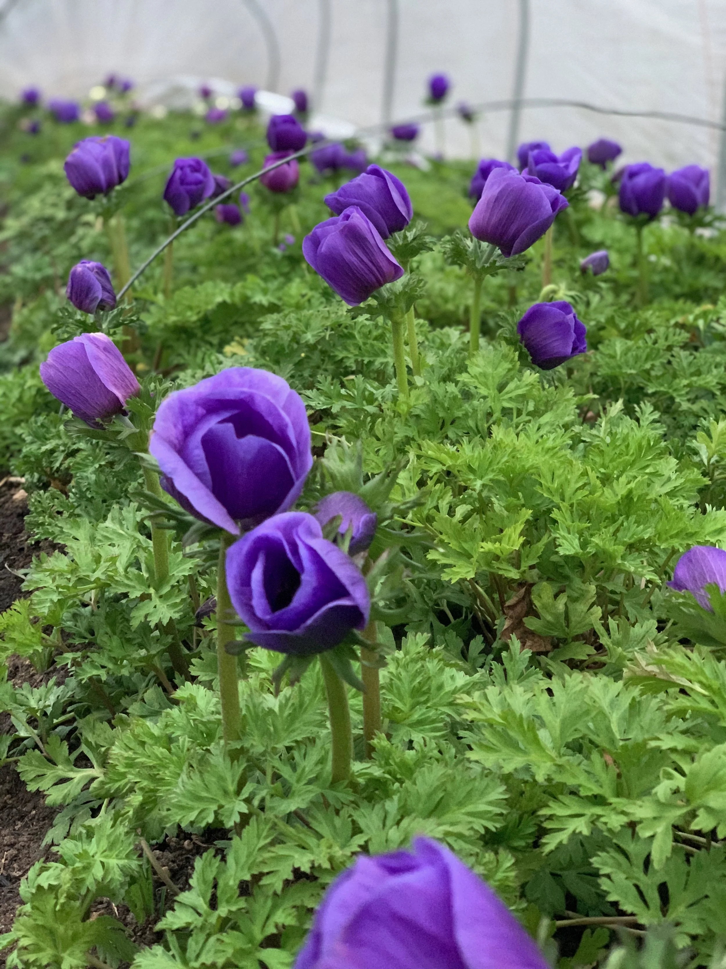
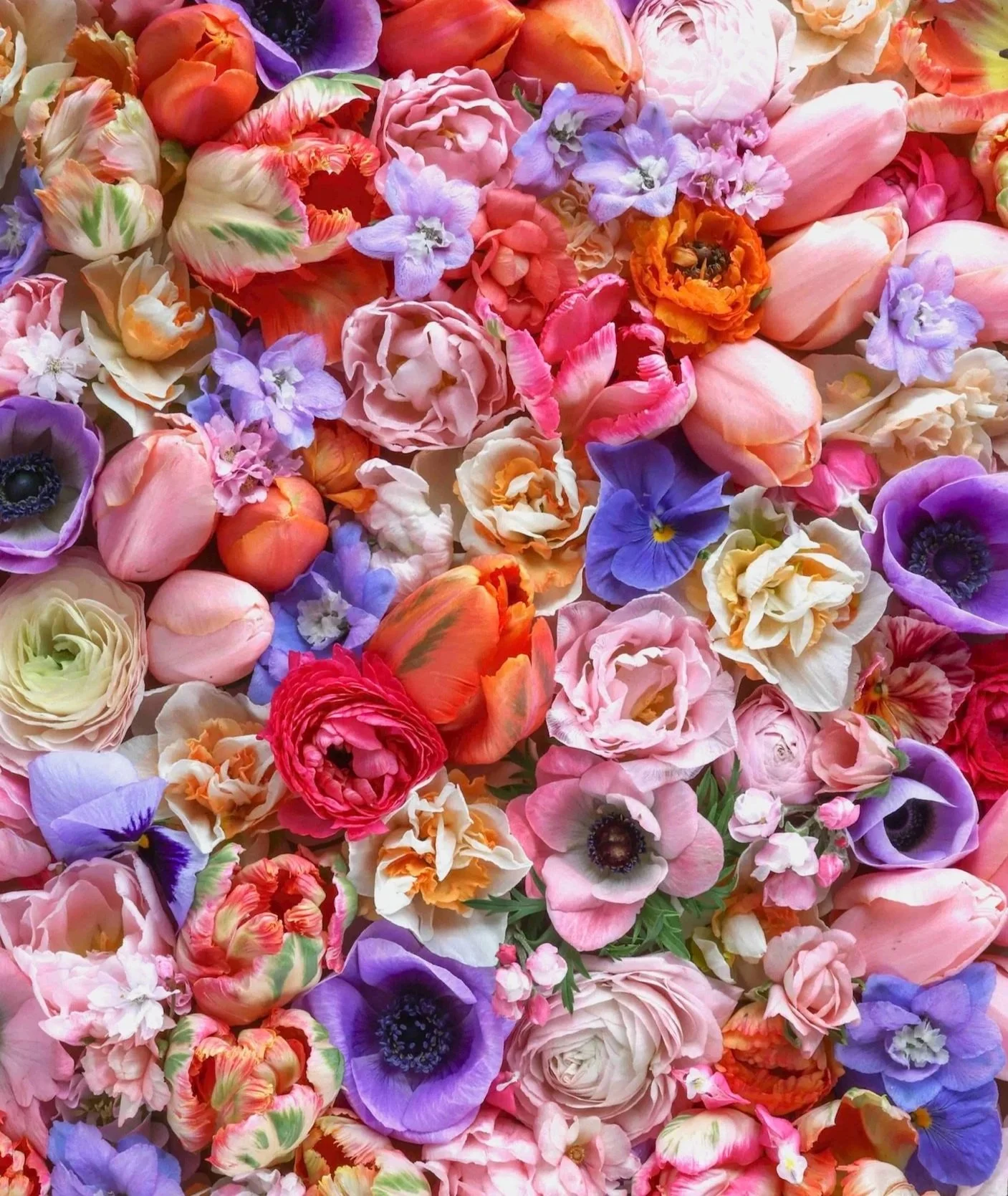
For a long time, I made planting decisions around what caught my eye. My second year, I ordered one hundred blue anemone corms — the minimum wholesale quantity—based on how gorgeous the handful I’d planted the year before had been. The color was electric. Their velvety petals looked almost dyed, the color so intense it barely seemed real. I was captivated.
What I hadn’t fully considered was how little room there was in my offerings for that much blue. It’s a color that does not blend in quietly with other flowers. To use all of those blue anemones, I would have had to design nearly every bouquet around that single, insistent shade.
That was one of my first lessons in the difference between growing something stunning and growing something usable.
These days, I’m particularly careful with what I think of as the color divas—the flowers that insist on being the soloist rather than a member of the orchestra. They’re spectacular, but they only work in small doses. Grow too many, and suddenly every bouquet revolves around them.
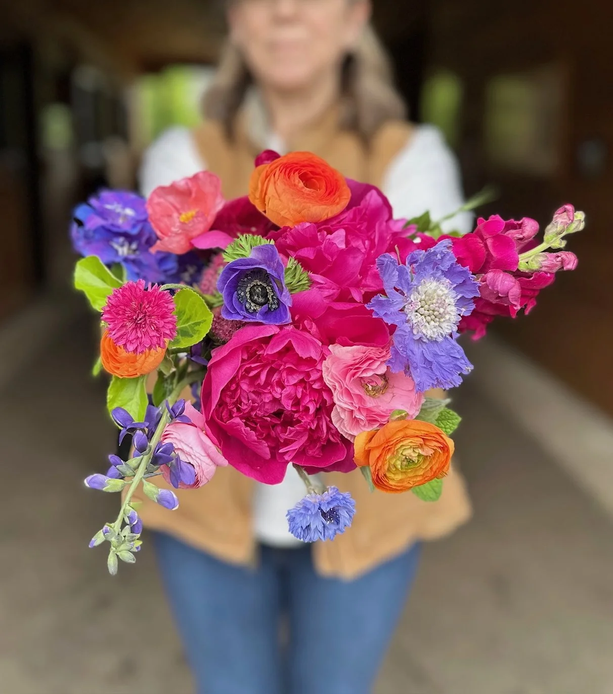
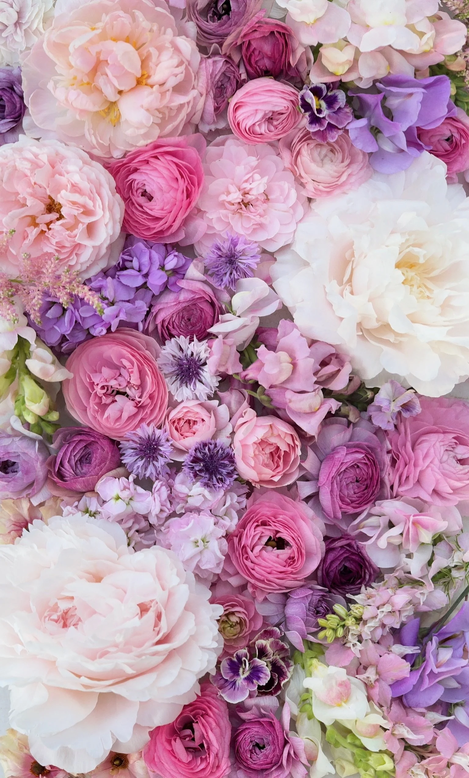
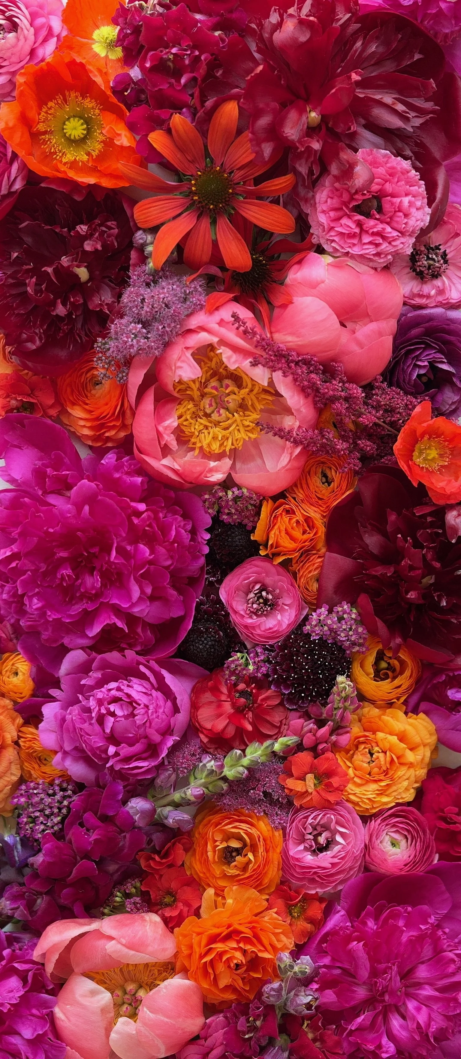
There aren’t too many bouquet color combinations that deep blue (purple) anemones can fit into, without overpowering the other flowers. The “Electric Unicorn” color palette (center), with its saturated pinks and oranges, is one of the few that can.
When Color Finds its Structure
Over the years, experiences like that pushed me toward a much more structured way of thinking about color.
Today, most of what I grow fits into a limited portfolio of signature color palettes. Each palette acts as a guide for what I plant, what I harvest, and how those flowers ultimately show up in bouquets. The goal isn’t rigidity. It’s cohesion.
A palette gives beautiful flowers a place to belong. It helps prevent the “too much of one thing, not enough of another” problem. And it allows the field to bloom in its natural rhythms without the bouquets feeling scattered.
Instead of just growing beautiful things and hoping they work, the palette does the quiet organizing work in the background.
Color Clarity Changes Everything
Once I established clear color stories, certain patterns became obvious.
Some shades are versatile enough to move across multiple palettes. Those can be planted generously. Others only appear in one or two palettes and need to be grown with restraint. For example, Amandine Chamallow ranunculus fits into multiple spring palettes and I can hardly plant enough of it. Purple Jean ranunculus, on the other hand, really only belongs in one or two palettes, which means I have to be careful not to overplant it.
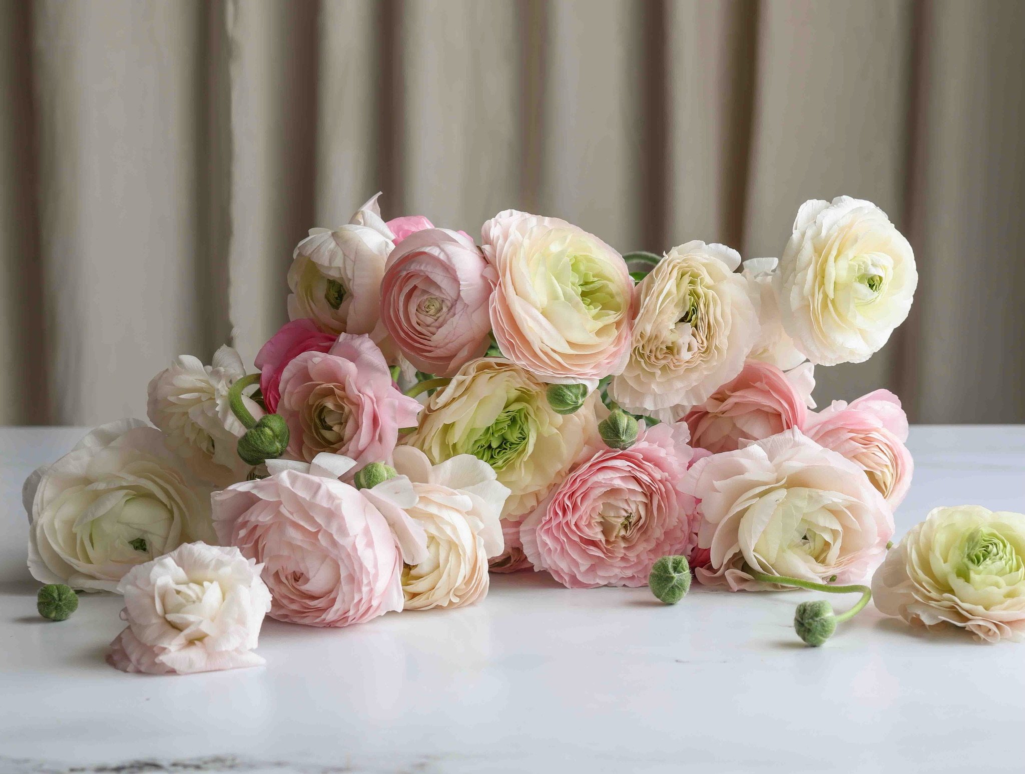

Both of these ranunculus varieties are gorgeous, but Chamallow (left) can be used in multiple palettes, whereas Purple Jean (right), only fits into one or two.
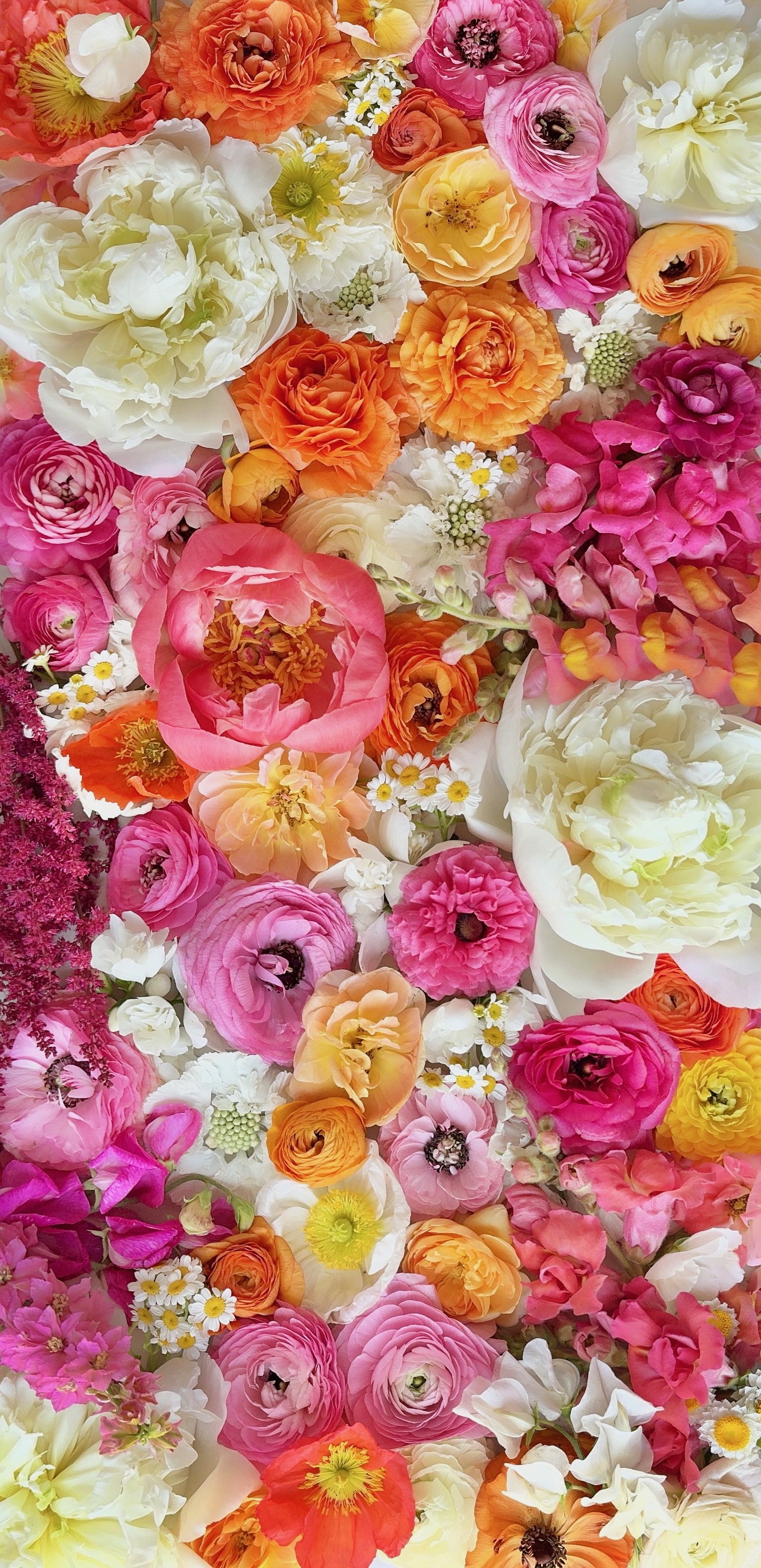
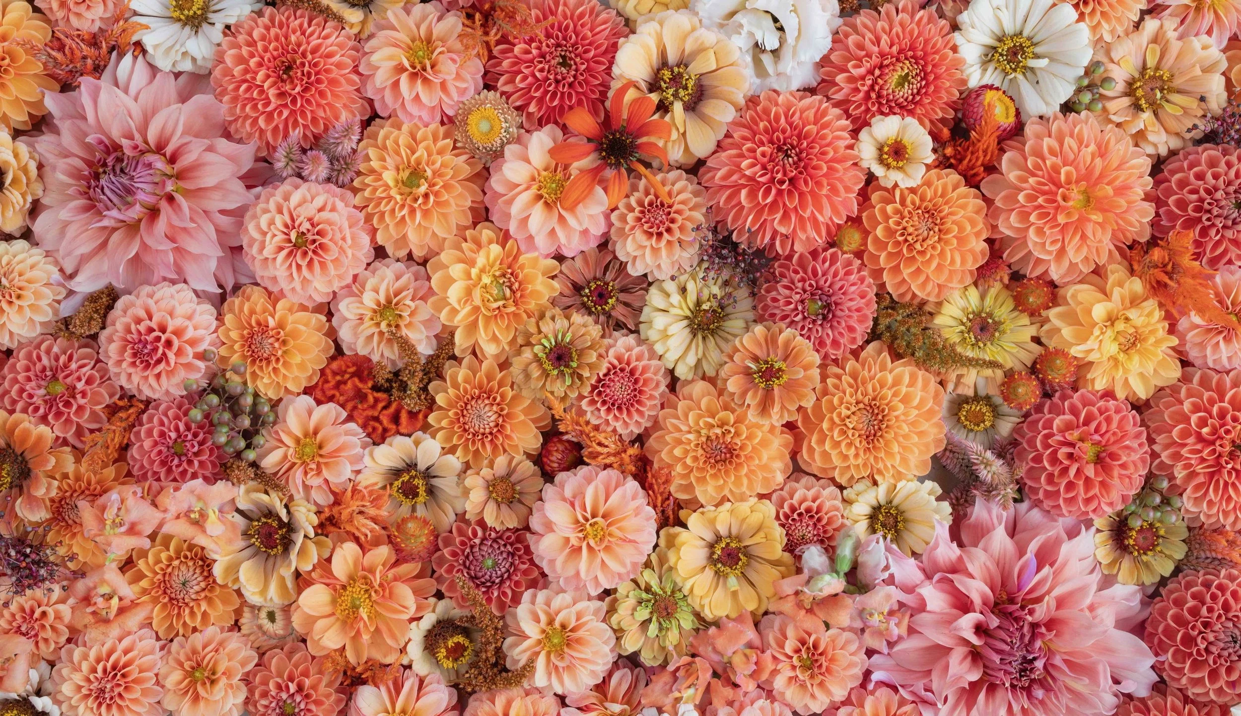
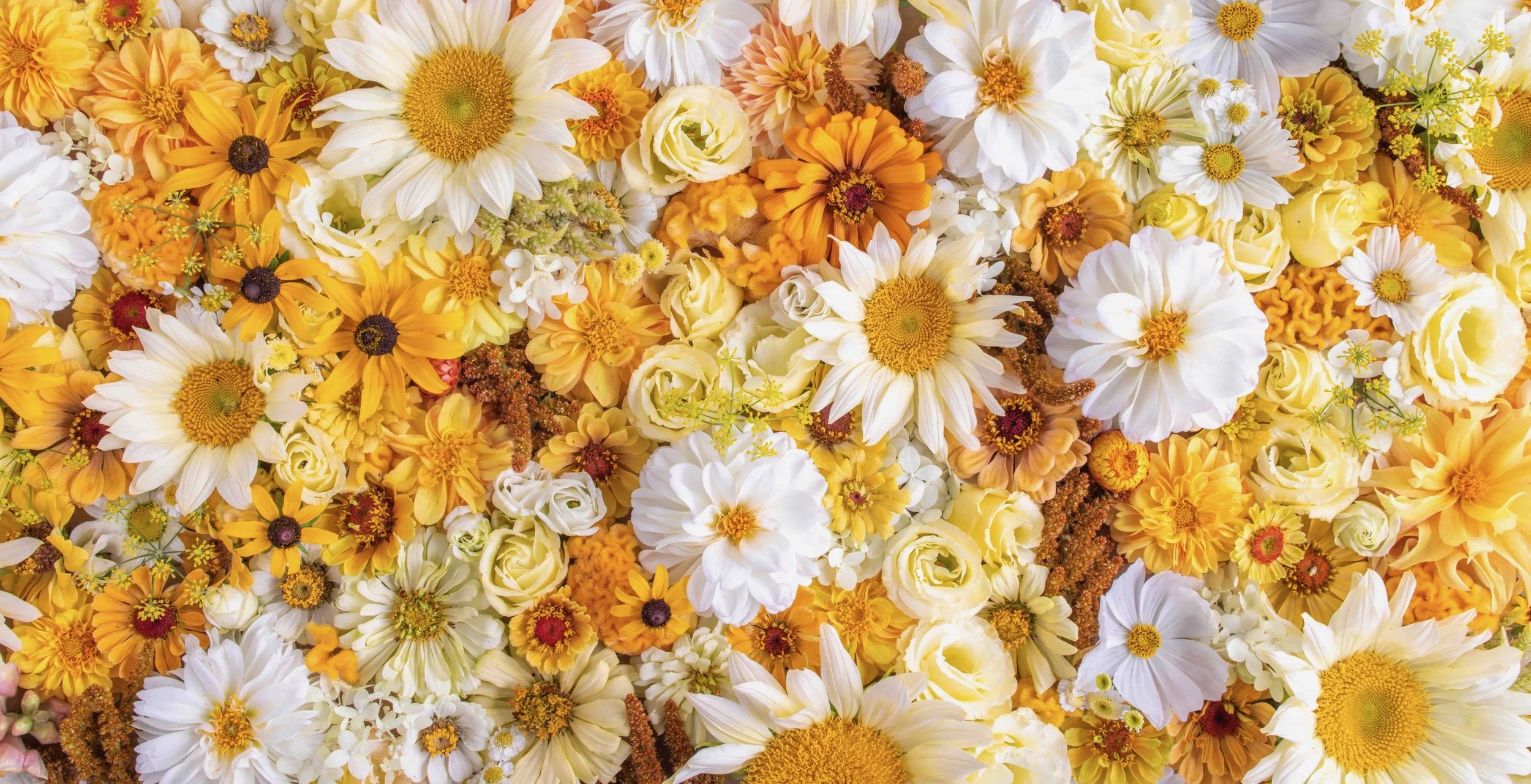
The palettes themselves aren’t rigid recipes. They allow me to design within a color range as production ebbs and flows. Capri Cocktails, for example, blends rose, coral and orange hues. One week we may have more corals, the next more oranges. The palette still works. Birthday Cake behaves the same way. Some weeks lean more orange. Others shift toward pink. The proportions change, but the palette still reads the same.
That flexibility allows me to absorb what’s peaking in the field without the bouquets feeling scattered. The palette provides the structure; the flowers provide the variation.
Clear Colors Make Selling Easier
Color palettes have also transformed how we communicate with customers. Instead of offering vague descriptions like “spring mix,” we offer defined color stories. Customers aren’t ordering a surprise. They’re choosing a feeling.
This clarity allows us to:
Reuse imagery confidently year after year.
This is especially useful when we’re marketing subscriptions well before flowers are blooming. By the time we have fresh photos from the field, the sales window may already be closed.
Show customers exactly what to expect.
Even though the flowers change week to week, the palette provides consistency.
Offer color choices without overwhelming people.
Customers want options, but they don’t want to describe color combinations themselves. Palettes simplify that decision.
Simplify major pre-order moments like Mother’s Day.
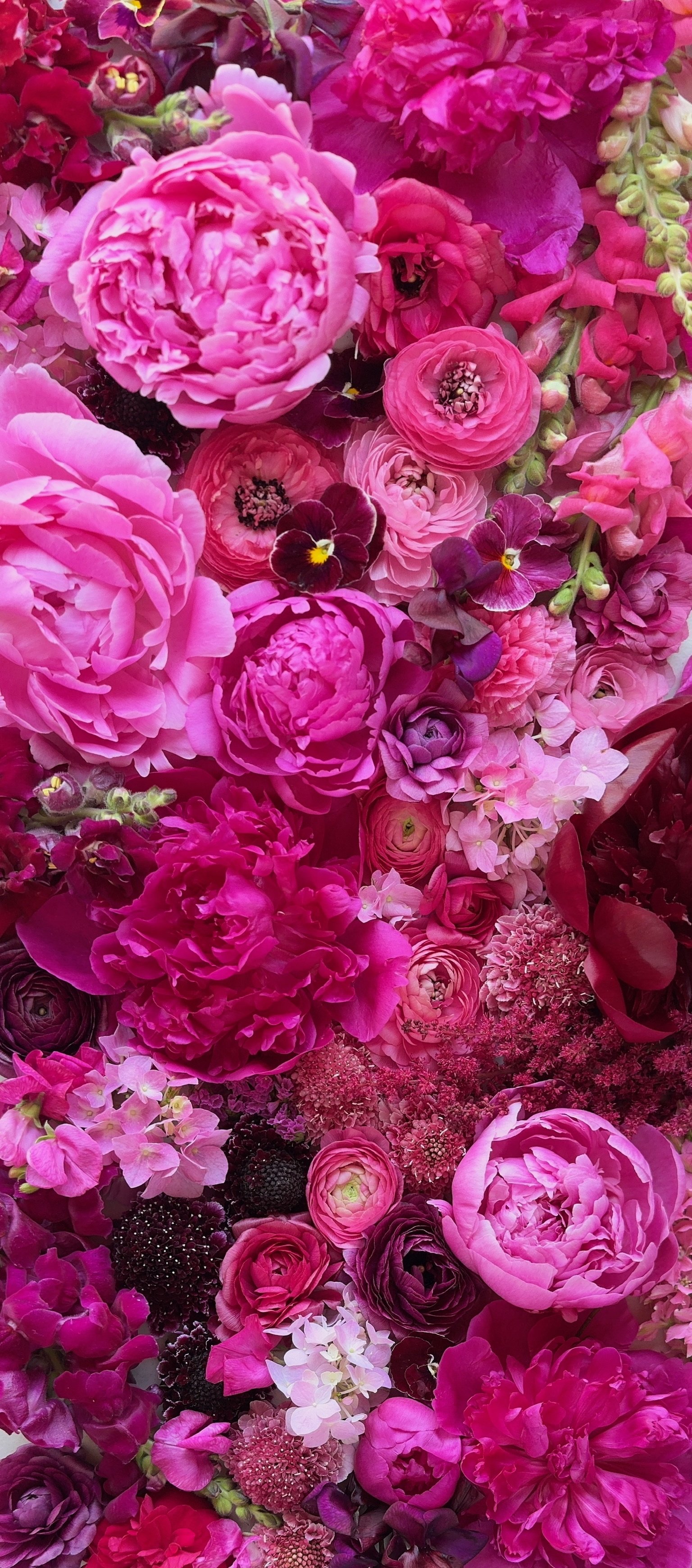
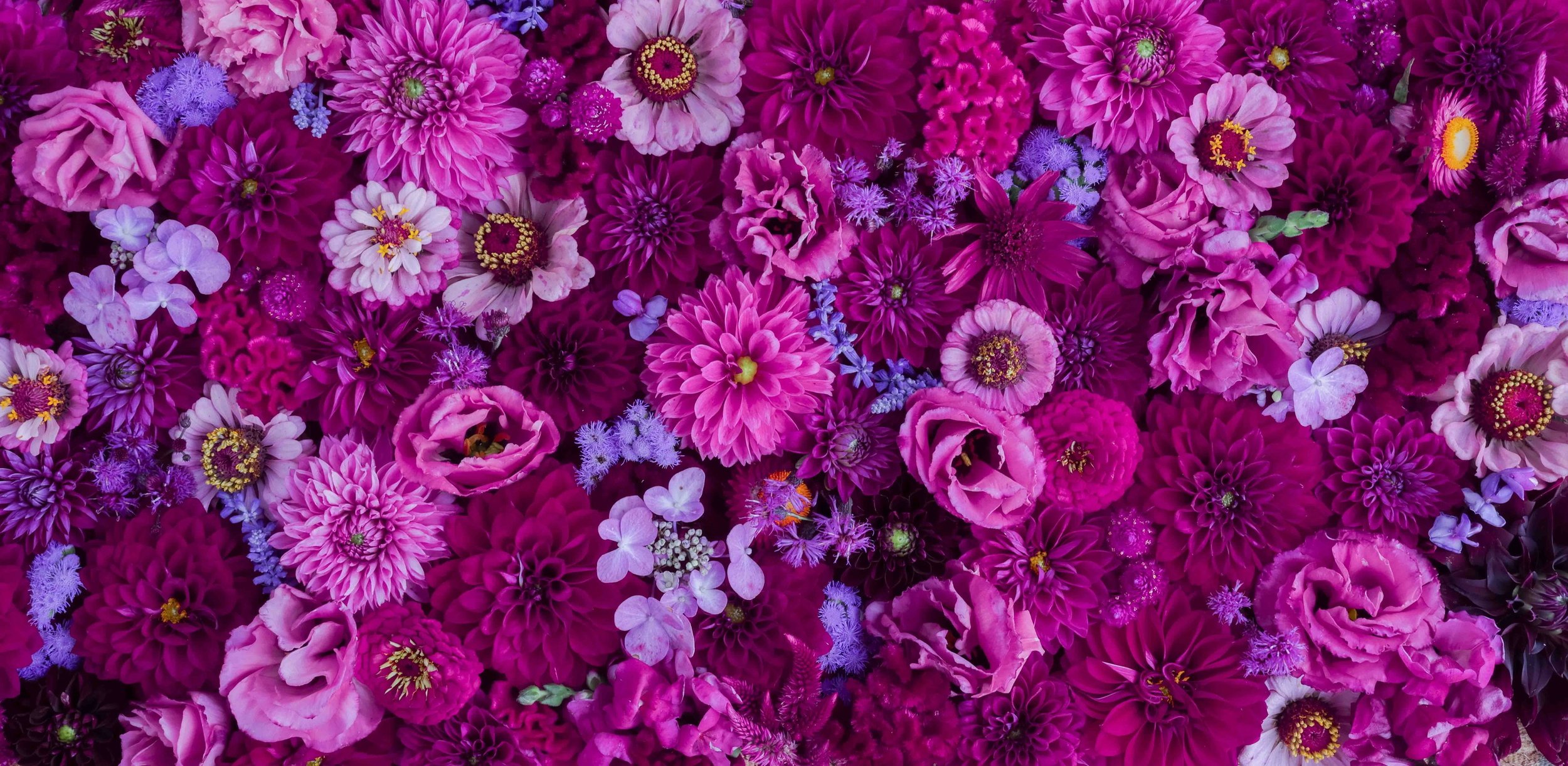
We offer just two palettes for Mother’s Day, plus a “farmer’s choice” option that allows us to use whatever is left over. The two palettes we offer—Champagne Brunch and Greta Got Robbed—are customer favorites and share some overlapping ingredients, which helps streamline our planting.
The bottom line is that consistency builds trust. And trust builds repeat sales.
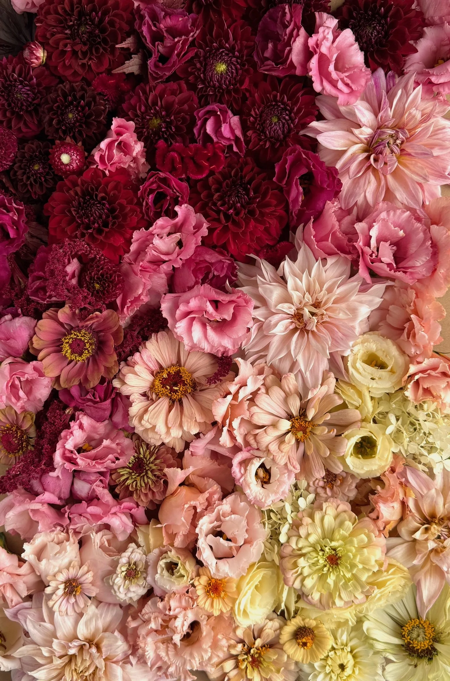
Bringing Champagne Brunch to Your Field
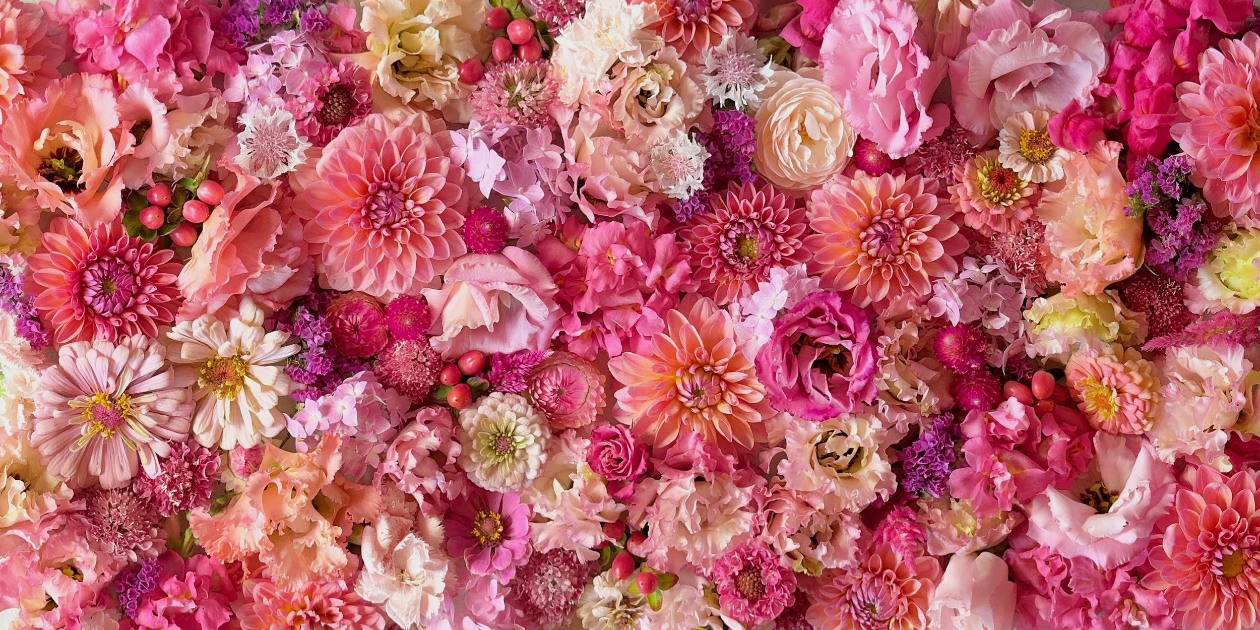
As mentioned above, Champagne Brunch is one of our customers’ favorite palettes (you can read more about how it was developed and why the palette works so well here). And while the flowers blooming in the field change from March through October, the palette itself stays in demand all season long.
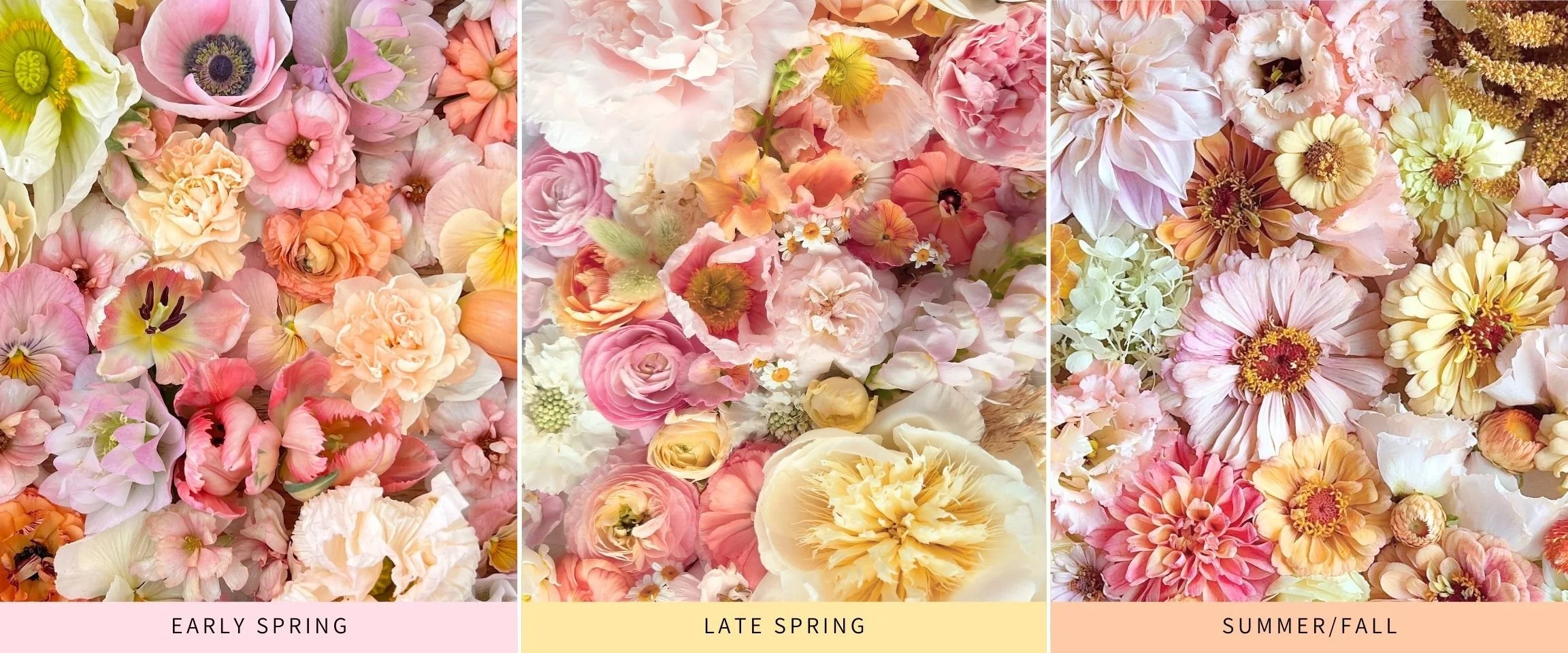
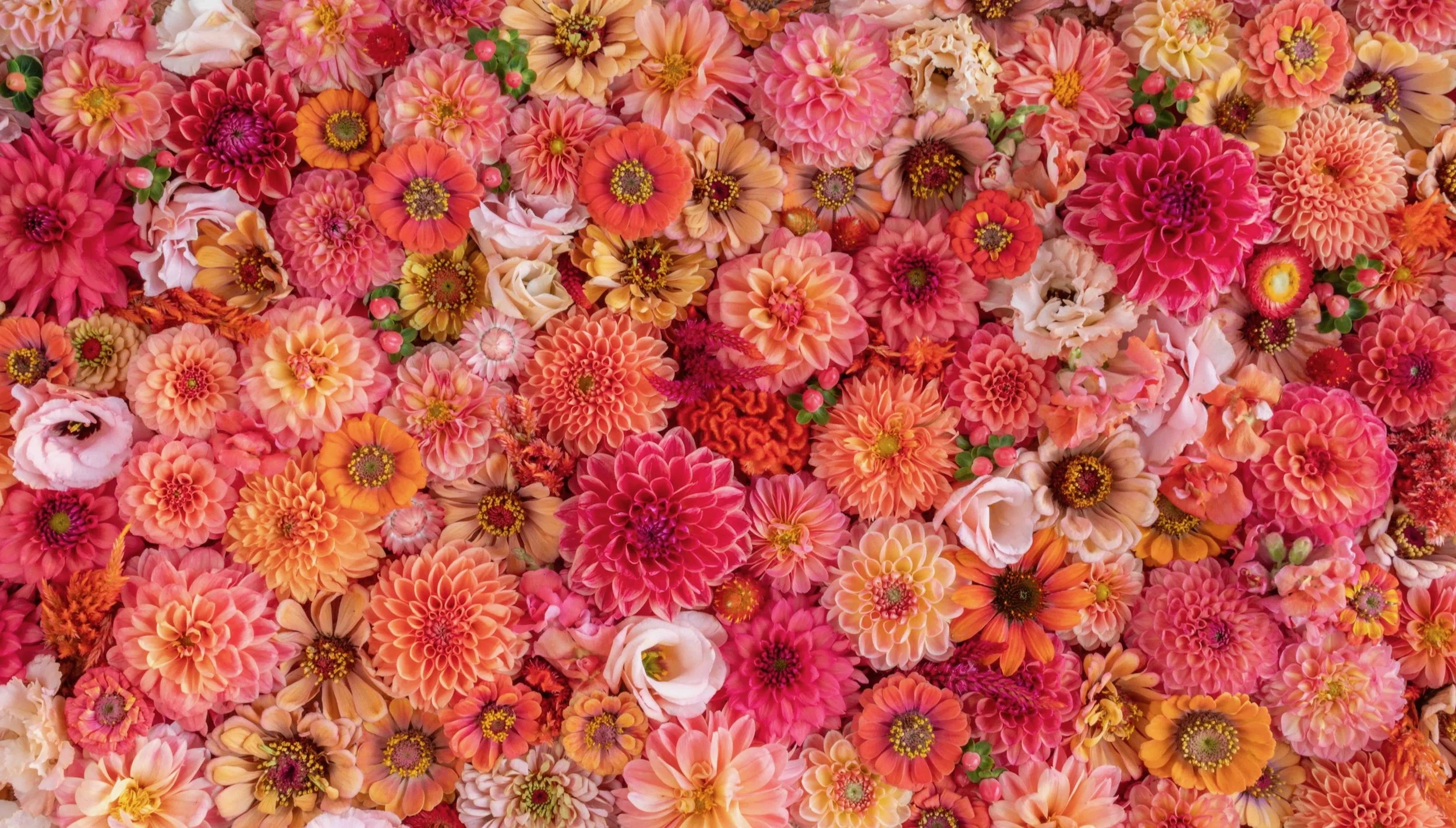
Champagne Brunch across all three seasons—the flowers change, but the overall palette remains constant.
If you want to bring this palette to your own customers, you’ll need a steady stream of flowers in its signature tones: champagne tones, soft yellows, peaches, warm pinks and one or two other key hues.
I created the Champagne Brunch Variety Guide to make that easier. It lists every variety I’ve grown for this palette, organized the way I always wished seed catalogs were structured: by bloom season and by Bouquet Blueprint™ flower role, so you can see exactly how the palette holds together even as the flowers change.
If you'd like to grow this palette on your own farm, you can explore the guide here:
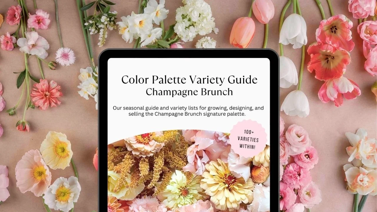
Variety Guide: Champagne Brunch
🌸 100+ Varieties (Cultivars + Colors Listed)
🗓️ Organized by season for year-round growing