

Color Commentary: The "Unicorn" Sweet Piedmont Signature Color Palette
My family is big on board games, and back when Pictionary was all the rage, my sister and I were an unbeatable team. It wasn't even a contest. One of us would draw something that looked, to everyone else at the table, like a random squiggle, and the other would call it within a handful of guesses — "school bus!" "hide-and-seek!" "turtle!" — obvious, somehow, only to us. I've never seen my dad truly upset about the outcome of a game, but he came close that night, convinced we had to be cheating. (Full disclosure: there were probably some very subtle body-language tells involved. But my point stands — those slight facial expressions or micro-movements were unintelligible to anyone else. It was still sibling ESP.)
That's the kind of read my sister has on me, and it's why, when she gives me a gift, she nails it. Every time. So when she sent me a summer-weight robe many years ago — soft, thin cotton, printed all over in a paisley of periwinkle, pink, coral, and peach — of course it was exactly right. The colors on the robe are fading now, and it's worn thin in a few spots, but every time I wear it, I think of my sister — and how I get to wrap myself, quite literally, in a treasure from one of my most favorite humans, made up of every one of my favorite colors.
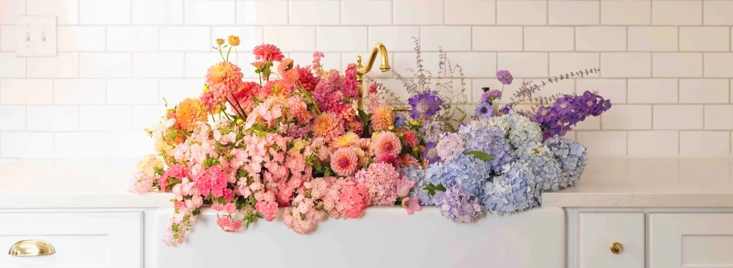
That paisley print is the "Unicorn" color palette: periwinkle-blue, pink, and peach-coral-salmon. I'll admit this palette isn't "refined." If anything, it edges toward juvenile — three candy-bright hues under a name to match. But, somewhat surprisingly to me, it's one of the best-selling color palettes we offer. (I thought I was the only one still nostalgic for that time when we were all layering our polo shirts with the collars popped and Miami Vice made pastels cool for guys, too.) Perhaps whatever made us love seeing these colors layered together back then is the same thing making this palette sell the way it does now.

Chromatic Coordinates: Mapping the Palette to the Color Wheel
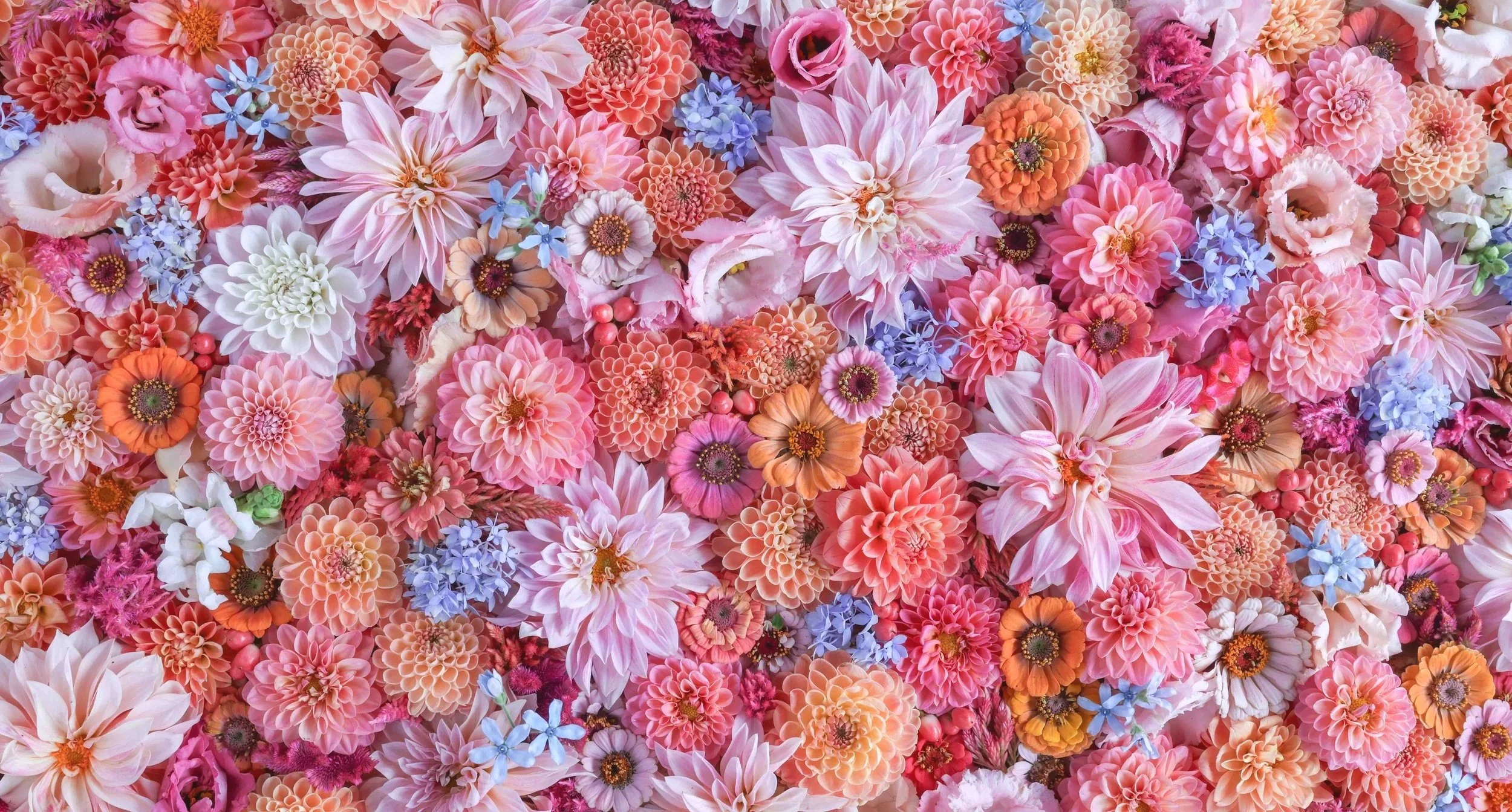
The "Unicorn" floral color palette is built from three hues: pink, peach-coral-salmon, and a cool, blue-leaning purple. Unlike Champagne Brunch or Greta Got Robbed, which each pull from one contiguous neighborhood on the color wheel (a true analogous grouping), Unicorn pairs a warm analogous duo — pink and peach/coral sit right next to each other — with a cool counterpoint pulled from further away on the wheel.
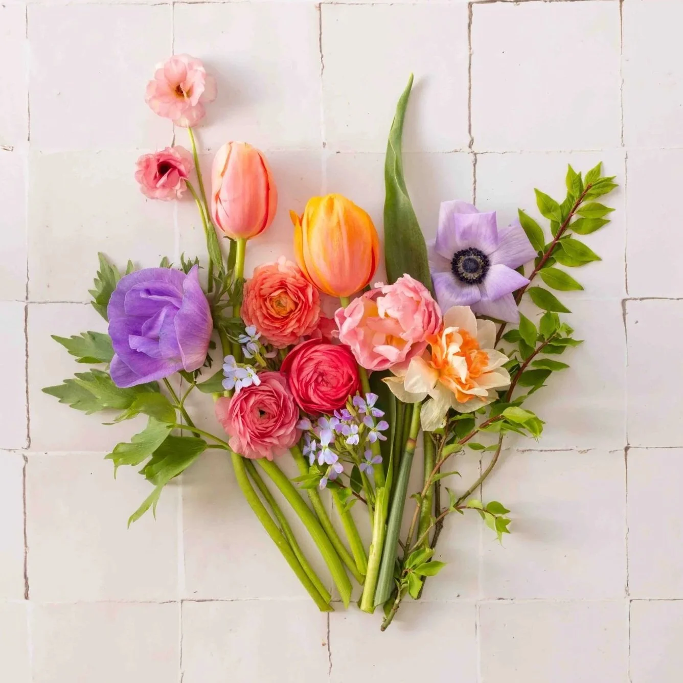
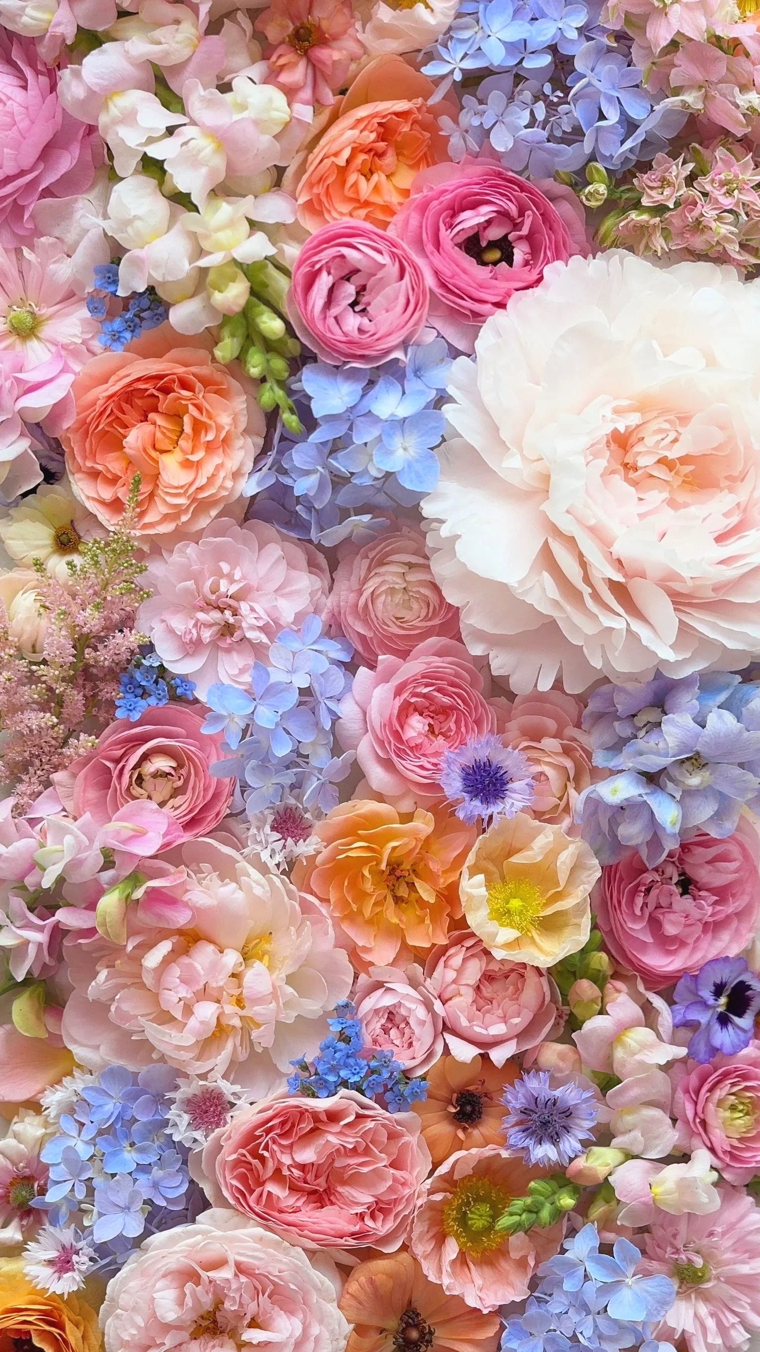
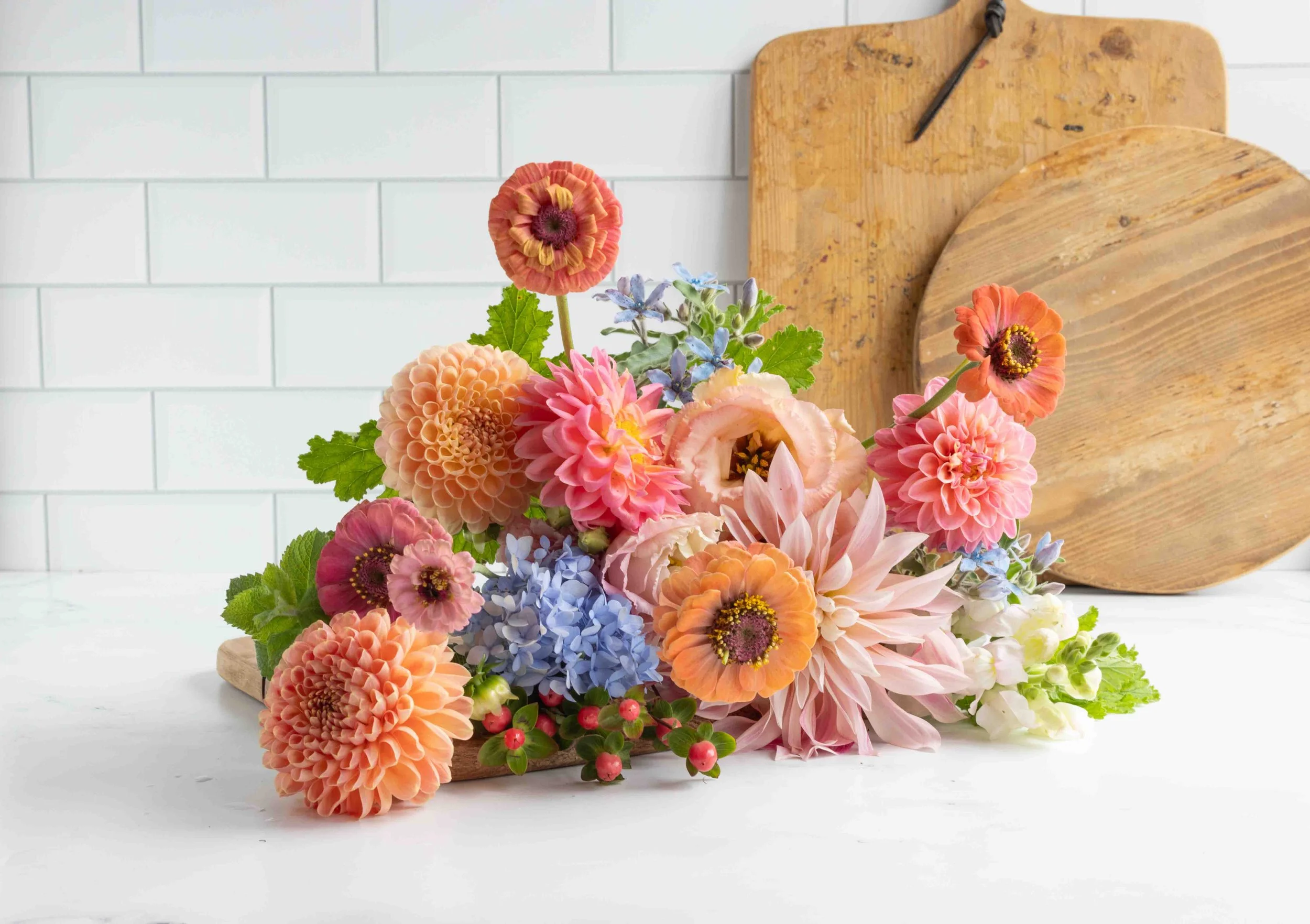
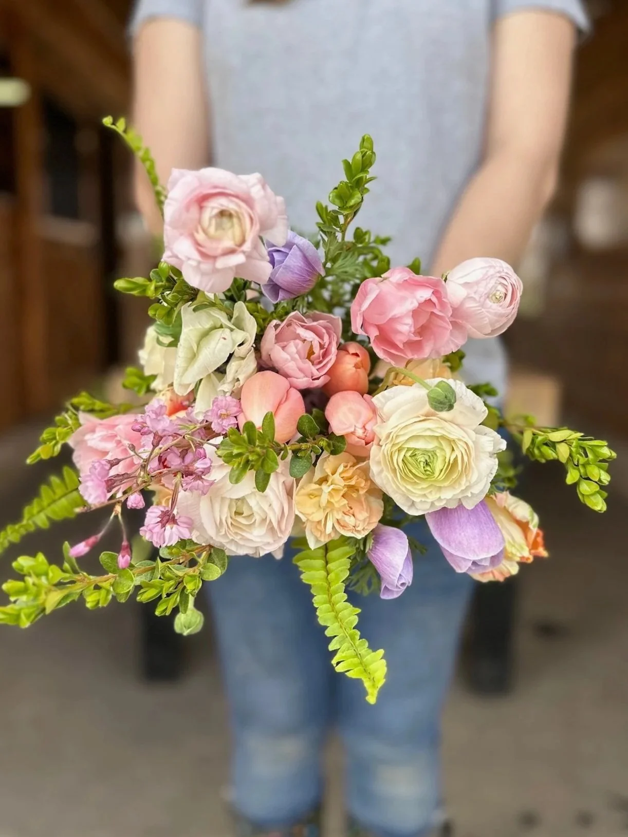
Whether it’s early spring (left, when tulips are the main focal flower), late spring (peony season, middle photo), or summer/fall (right) the Unicorn color palette is a customer favorite.
That cool counterpoint deserves its own explanation, because "blue" in the vocabulary of horticulture rarely means what it sounds like. True blue is one of the rarest colors in nature — there's no such thing as a true-blue dahlia or a true-blue zinnia, no matter how hard breeders' catalogs may try to convince you otherwise. While there are a few true blue-hued flowers (Tweedia, some of the delphiniums, for example), what typically gets called a "blue" flower is almost always periwinkle: a violet that leans just cool enough to read as blue if you look at it just right.
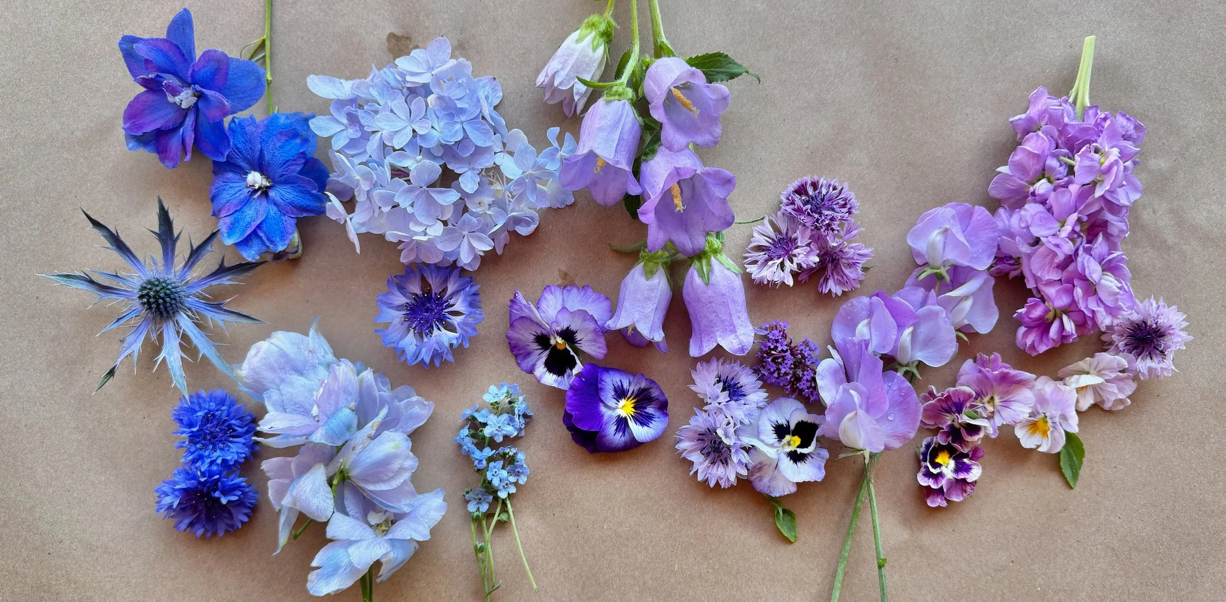
This gradient shows the range in one frame — the closest to true blue at the left end (Eryngium “Blue Glitter”, various delphinium, “Blue Boy” Bachelor Buttons), and warm lavender-purple at the other (lavender stock, Bachelor Button “Classic Magic”), with periwinkle sitting in between (Hydrangea “Endless Summer, a “Classic Fantastic” Bachelor Button, and Chinese Forget-Me-Nots).
For Unicorn, periwinkle — the cooler end of the purple range — is the standard, because it sits furthest from pink and peach on the wheel and gives the palette some contrast. A warmer lavender-purple works too, and some seasons practically require it, but it's the backup, not the ideal, as it lowers the contrast that gives Unicorn its vibrance.

On the color wheel, that periwinkle dot sits well apart from the pink and peach cluster. That gap is what gives Unicorn its “pop”: the further the cool note sits from the warm pair, the more contrast the whole palette reads.
The availability of those cool purples shifts with the season. In early spring here at Sweet Piedmont, anemones are an easy source of periwinkle, a time when we are otherwise awash in a sea of pink, peach, and coral ranunculus and tulips. In late spring, delphinium, nigella, and bachelor's buttons bring it. Summer and fall are harder: there's no reliable blue-lavender dahlia, zinnia, or celosia, so the cool hue tends to come from a filler like hydrangea, a floater, such as blue scabiosa, or a finisher like eryngium — rather than a focal or foundation bloom. Leaning on a warmer lavender-purple to fill the gap is completely fine — Unicorn still works — but the lack of a the cooler blue-purple hue eliminates that extra bit of contrast.
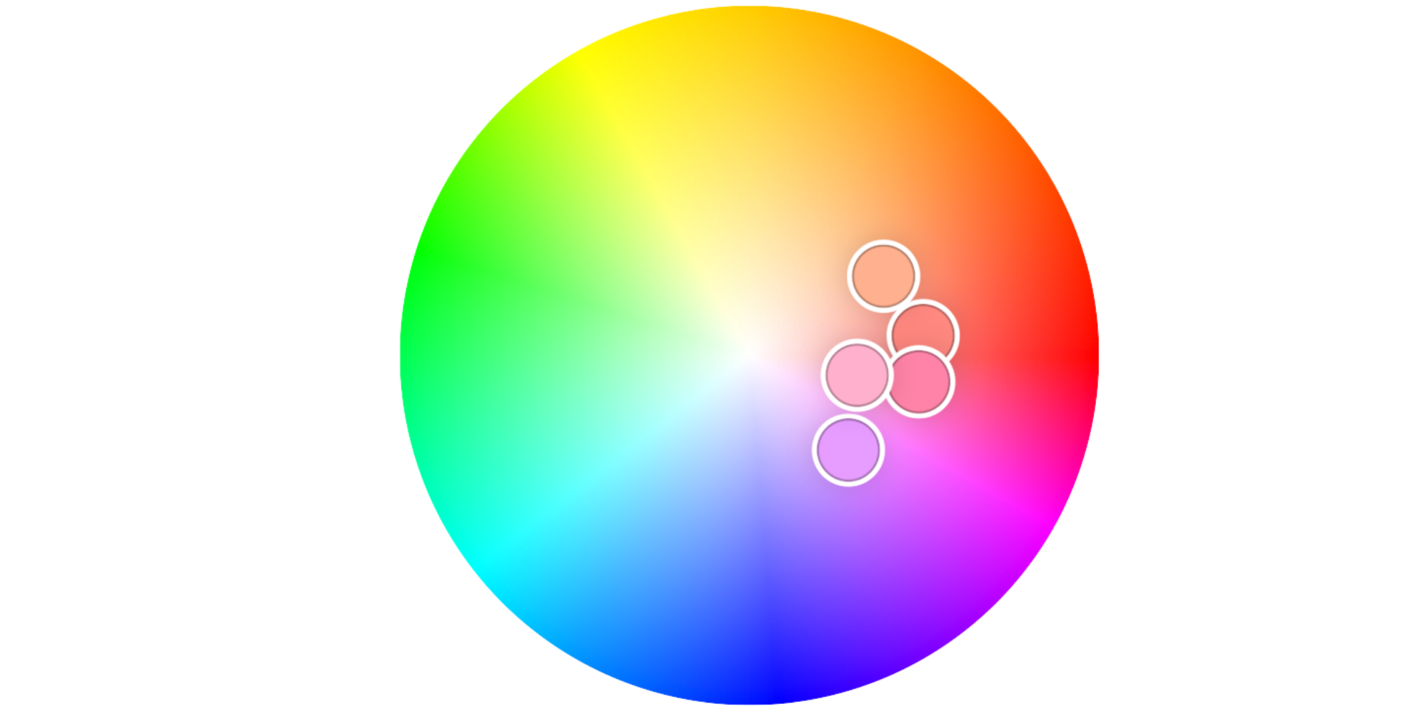
Warm the purple up, and the purple dot drifts in toward the pink/peach cluster instead of holding apart from it. It’s subtle, but that small shift on the wheel softens the whole palette.
Palette Perfection: What Makes it Work – and What Wrecks It
All three hues have to show up for a bouquet to actually read as "Unicorn." Drop the blue-purple entirely and you've got a pretty pink-and-peach bouquet — lovely, but it's not this palette anymore. While each of the colors works well when paired with just one of the other hues, if only two of the three are present, the bouquet loses complexity and, well, it just isn’t a Unicorn!
One rule that keeps things from turning muddy or full-on rainbow is strict: don't let anything else in. No red or burgundy, no yellow (beyond the occasional stamen or throat on a flower, of course). White looks great with this palette, and it’s fine to put it in a Unicorn bouquet. But cream or yellow? That turns the palette into an Easter basket full of colored eggs: still pretty, of course. But not Unicorn.
The other culprit to watch for — a real unicorn-stealer — is anything with a muddy undertone, or anything that reads bronze/brown/beige. In other palettes (such as Pumpkin Spice, Wine Flight, and Champagne Brunch), Queen Lime Orange or Red zinnias, dried grasses, or plumes of golden amaranth are key elements. But mixing these smoky and muted tones into a Unicorn bouquet will kill the playful vibe, full stop.
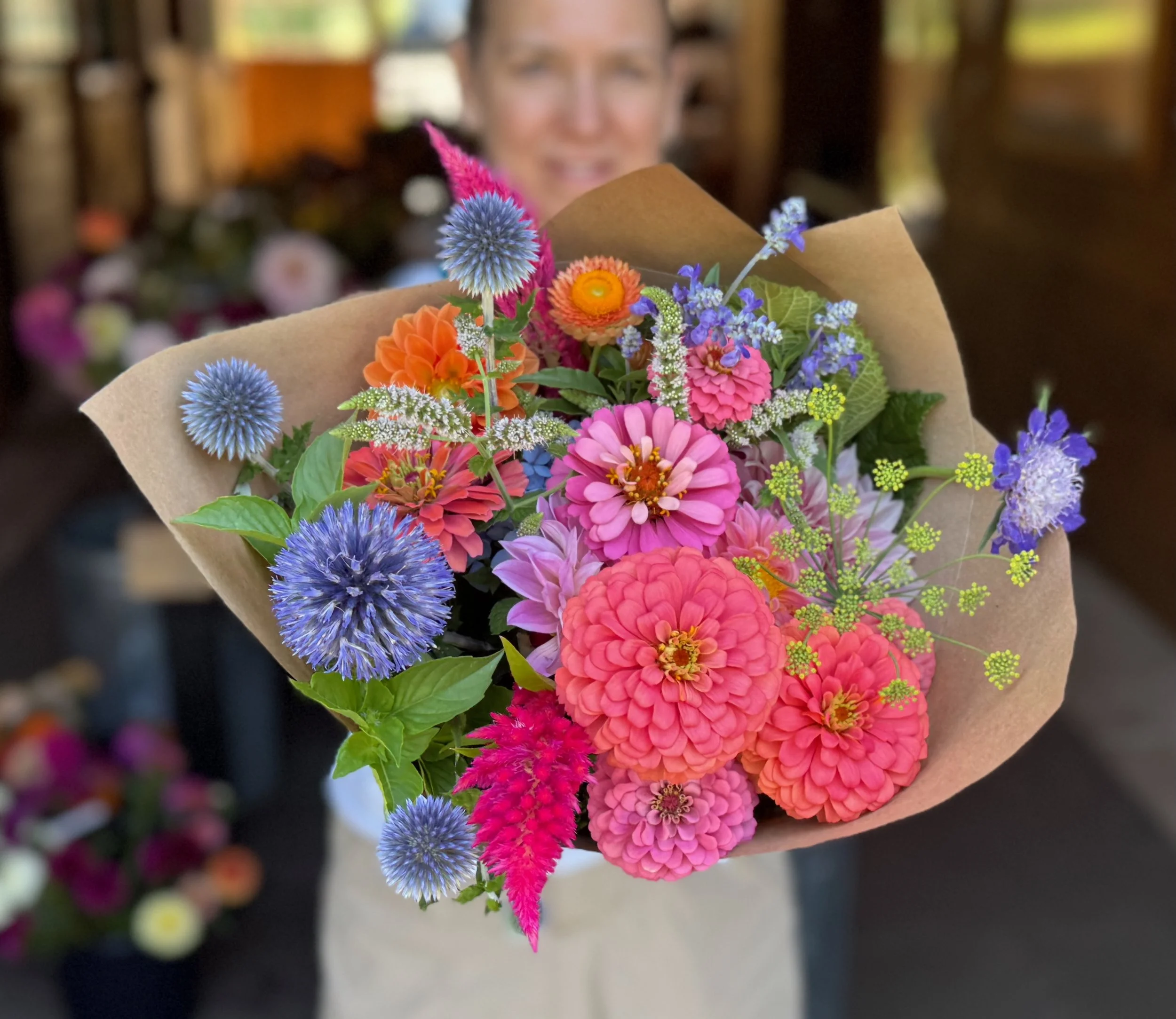
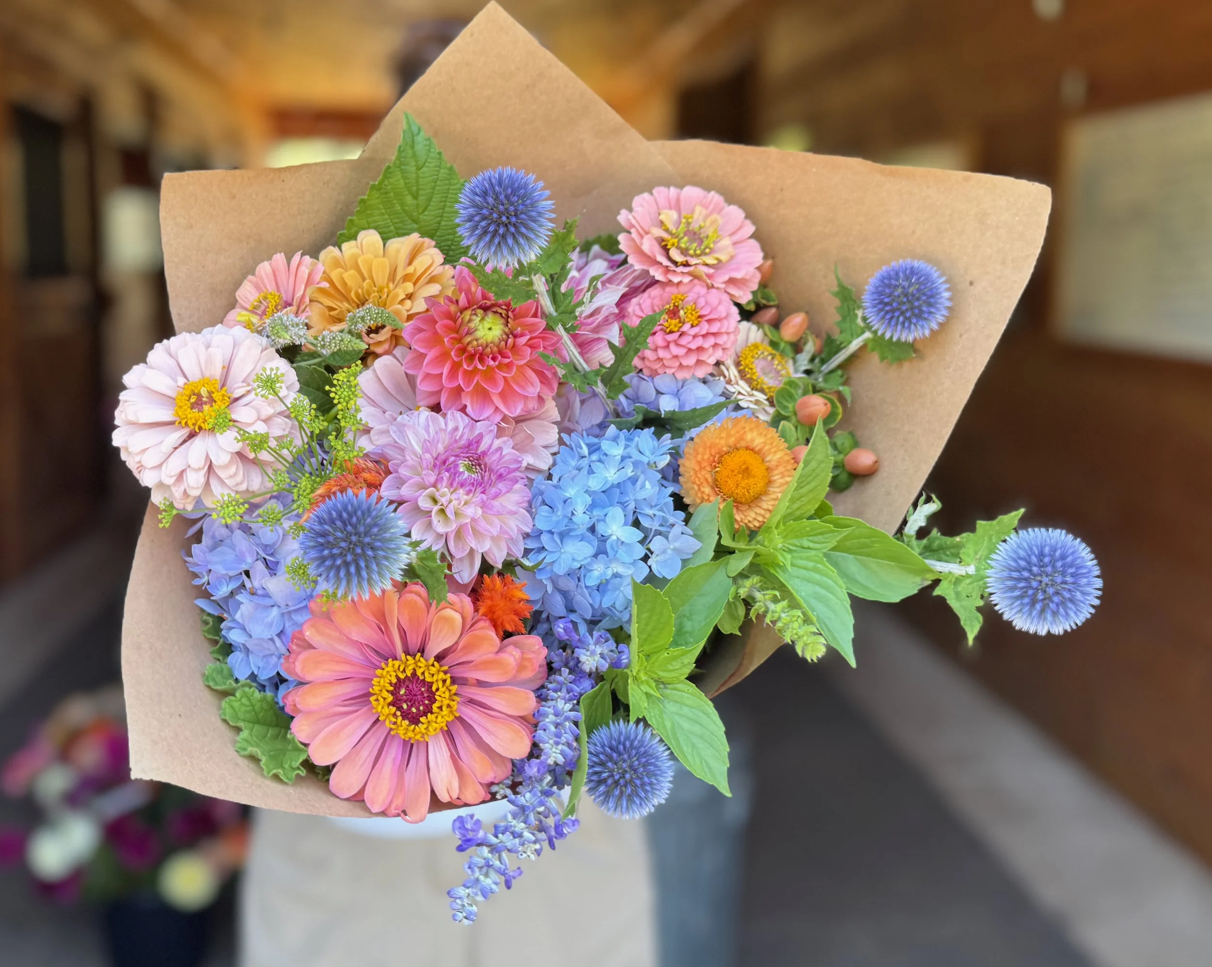
The other element to watch is color intensity: generally, you want to keep the saturation relatively consistent across the whole bouquet. This palette can be made in soft pastels (what I call "Mellow Unicorn"), medium-bright tones, or fully saturated hues ("Electric Unicorn") — but mixing pastel pink and peach flowers with a dark, saturated purple, or soft lavender and peach with a screaming bright fuchsia, can read as a mistake rather than a deliberate choice.

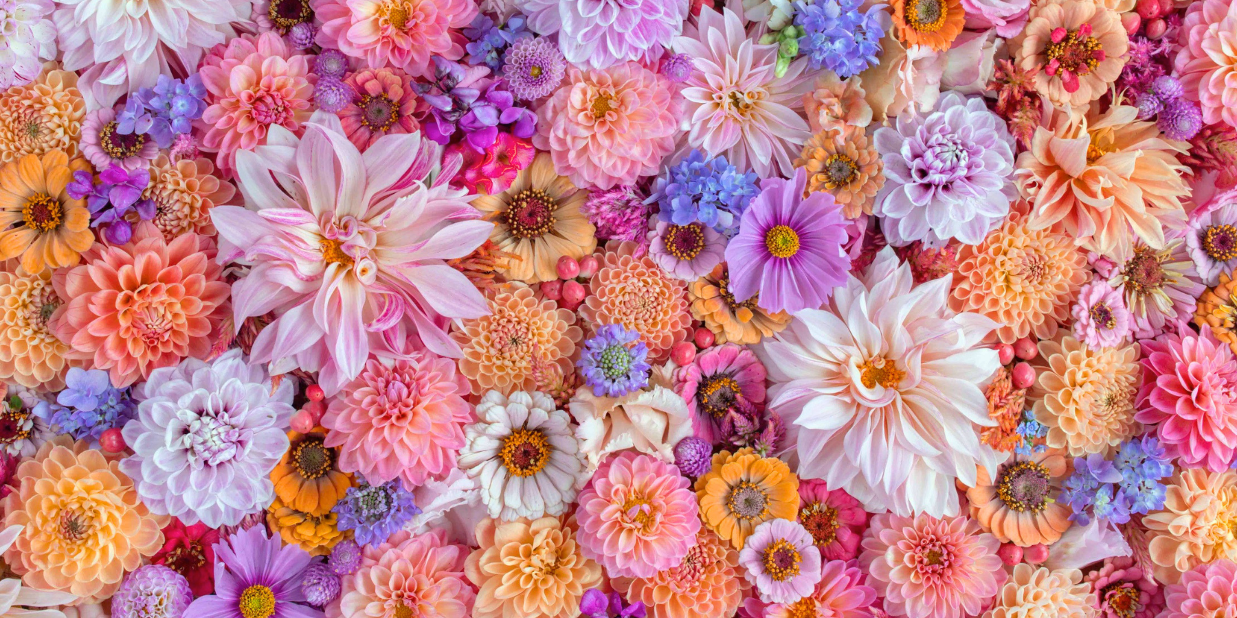
Same three hues (purple, peach, pink), two completely different volumes. "Mellow Unicorn" (left) stays entirely in pastel territory; "Electric Unicorn" (right) turns every hue up to full saturation. What doesn't work is combining the two intensities in one bouquet.
Mood in Bloom: The Psychology Behind the Color Palette
Pink reads as playful and affectionate. Peach and coral bring warmth and approachability. Periwinkle adds a touch of whimsy and calm — blue is one of the most consistently soothing hues in color psychology, and violet has long been tied to imagination and fantasy. Put the three together under a name like "Unicorn," and you get a palette that doesn't take itself too seriously on purpose.
Here's what I can tell you for certain: Unicorn is one of our most-requested color palettes, full stop, and at the farmers market, bouquets in this palette were almost always among the first to sell out. I don't have a tidy demographic for who's buying it — there isn't one. Even customers who otherwise gravitate toward moody or muted arrangements will stop at a Unicorn bouquet and say some version of "that's so pretty..." anyway.
I've started calling this the palette's "no-justification-required effect" — it doesn't ask to be taken seriously, and that's exactly why people respond to it before they've had a chance to think it over. It happens to line up with some real color psychology, too: preference for a color tracks the average emotional experience people associate with it, and the colors within Unicorn evoke sunsets, spring blossoms, ripe peaches, cotton candy — practically nothing negative riding on any of them. Pastels in particular carry a reputation as the "soothing, calming, nostalgic" family of colors, the deliberate counterweight to a visual world that trends louder every year.
That's probably the real reason it sells the way it does at Sweet Piedmont: it's not a sophisticated palette, and it doesn't pretend to be — it's pure, unapologetic delight, granting whoever's buying it permission to like something purely because it's pretty. No justification required.
Camera-Ready Colors: Floral Photography Tips for the "Unicorn" Color Palette
Good news: this is one of the easiest palettes to photograph. Assuming the three hues sit fairly close in value and none of them run especially dark or especially neon, the overall contrast stays low — which makes Unicorn far more forgiving of ordinary light than higher-contrast palettes like Wine Flight, or palettes built from subtle variations within a single hue, like Greta Got Robbed or Pumpkin Spice.
The one thing worth watching is the periwinkle-blue and lavender tones, which can shift toward gray or a duller violet under artificial light or a flat white balance — a fittingly unicorn-ish problem, honestly, that the one color you picked for its relative rarity is also the first to ghost you in a photo. When in doubt, check those hues first — if they're reading true, the rest of the bouquet almost always falls into place.
Color Palette Variety Guide
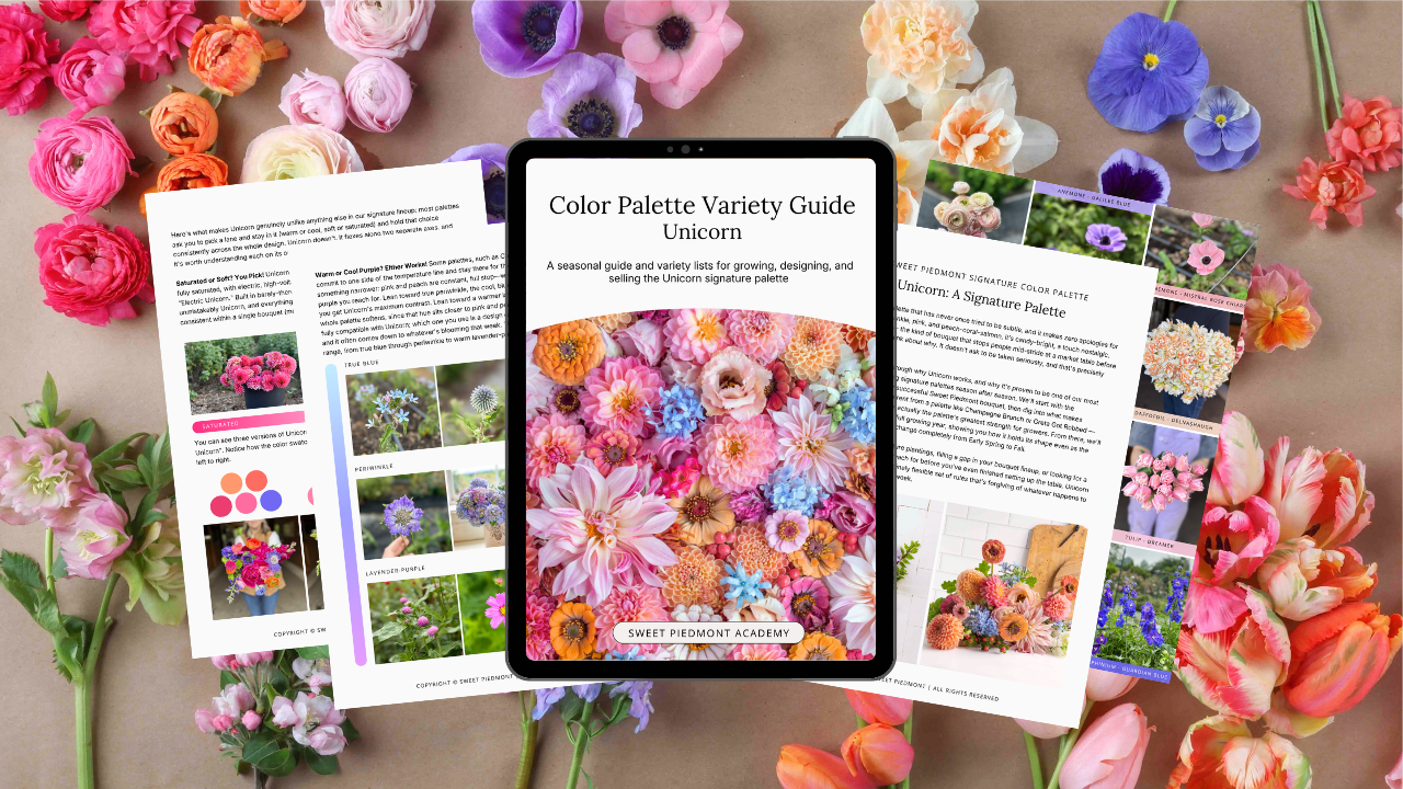
Ready to master the Unicorn palette? Learn exactly what to grow and how to pair your ingredients for stunning, sellable bouquets with the Unicorn Color Palette Variety Guide, which includes:
200+ Grower’s Variety & Cultivar List
A Unicorn Color Study
Unicorn in Every Season
Where & How Unicorn Sells