

Color Commentary: The "Wine Flight" Sweet Piedmont Signature Color Palette
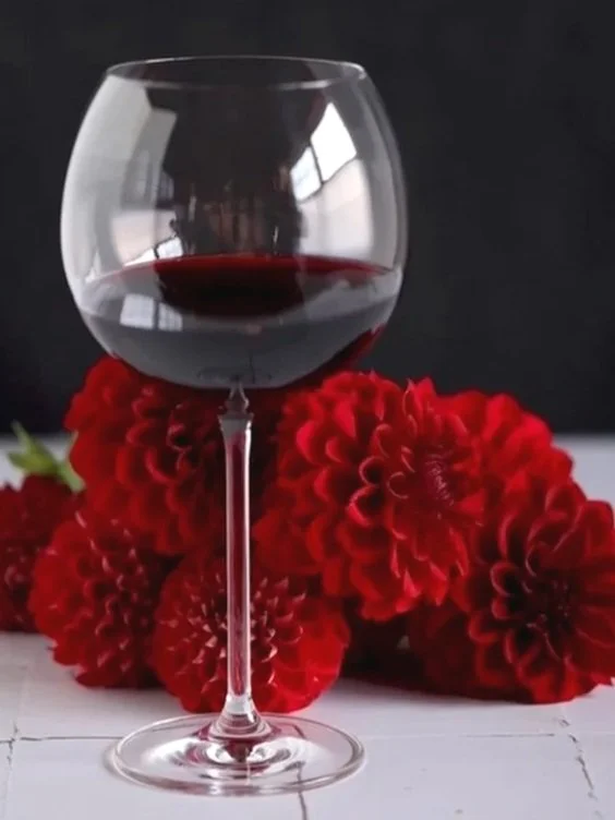
Picture rolling hills stitched with grapevines, a tasting room porch catching the last of the golden-hour light, and three glasses lined up on a wooden flight board — pale straw, dusty rose, and a red so dark it looks almost black until the sun catches it. That's an easy scene to imagine here in Virginia wine country, because I don't actually have to imagine it. Sweet Piedmont sits close enough to some of the region's wineries that I could practically throw a rock and hit one.
One of them, in fact, is the reason Sweet Piedmont Flowers exists in any commercial sense at all. The very first flowers I ever sold went to the winery just down the road from us. I remember exactly how terrified I was walking in that day to ask whether they'd be interested in buying arrangements. They said yes, and they became my first customer. I've been grateful to them ever since — we started our businesses at almost the exact same time, and I like to think we've grown up together a little.
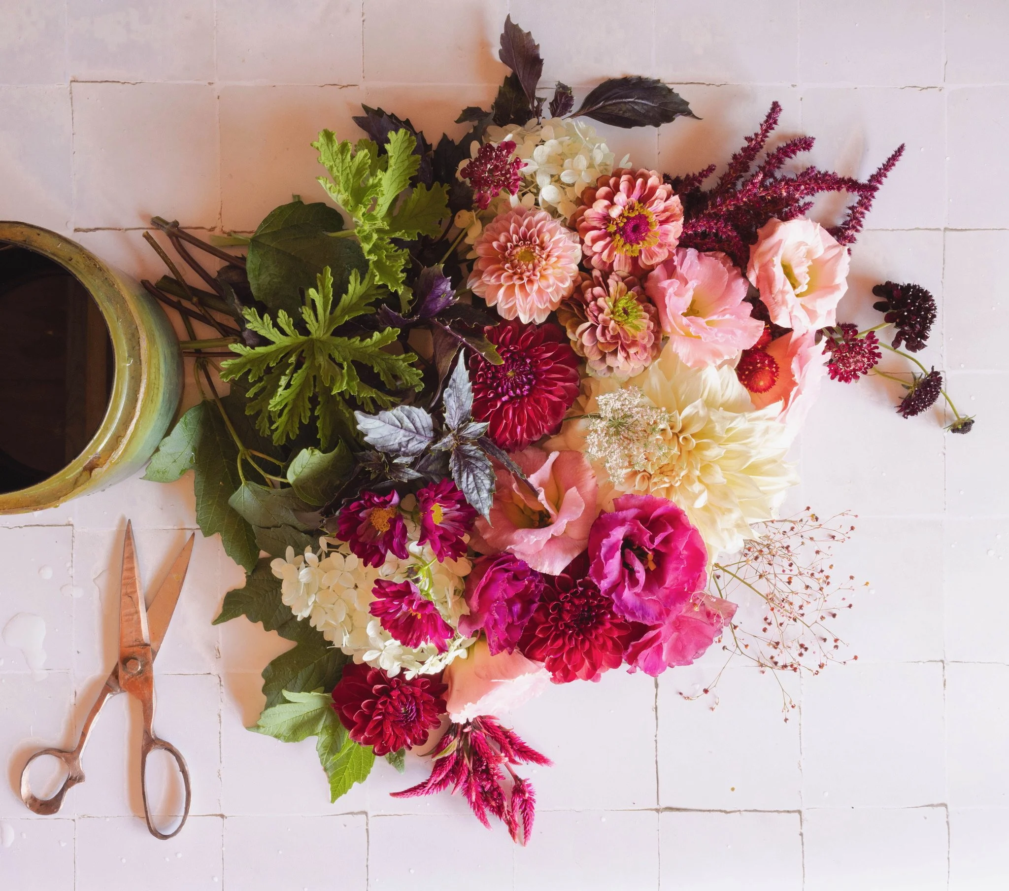
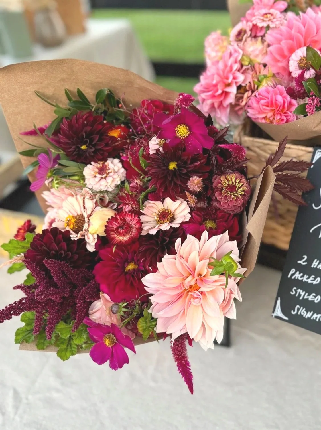
I didn't build the Wine Flight palette with that winery in mind, and there's no clean origin story connecting the two. But I don't think it's a coincidence that a farm surrounded by vineyards eventually produced a color palette built the same way an actual flight of wine is built — three glasses, three distinct hues, one shared theme. It happened almost by accident. I was working with the blush-and-burgundy combination that was, a few years ago, nearly inescapable in weddings. I mixed in some cream — a nod to the bride’s dress — and looked at what I'd put together. And there it was, sitting right in front of me: a flight of wine. Cream for the white wine. Blush and light pink for the rosé. Burgundy, deepening almost to black, for the red.
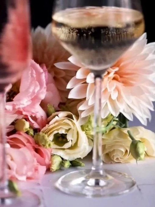
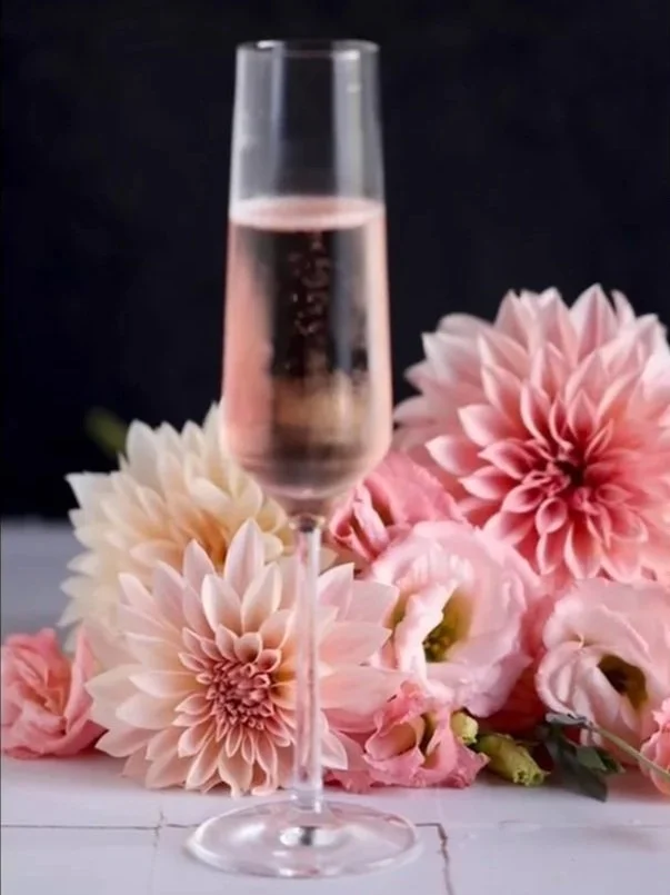
One of the first videos I ever made paired these flowers with actual glasses of wine — sparkling rosé alongside the blush blooms, red wine alongside the reds and burgundies. What struck me, watching that footage back, is how much color lives inside a single glass of wine depending on the light and what's around it. A red can look black in one moment, true burgundy in the next, and have flashes of bright scarlet when the light hits it. A white wine can go cool and pale, or turn warm and buttery.
And then there's rosé. Somewhere between blush and pink, with just enough gold undertones to catch the light, it's a color I could stare at far longer than is socially acceptable at a dinner table. Give it a little sparkle, and it turns into something else entirely: each bubble rising through that pink like a tiny spotlight, catching the color and throwing it back brighter for half a second before it's gone.
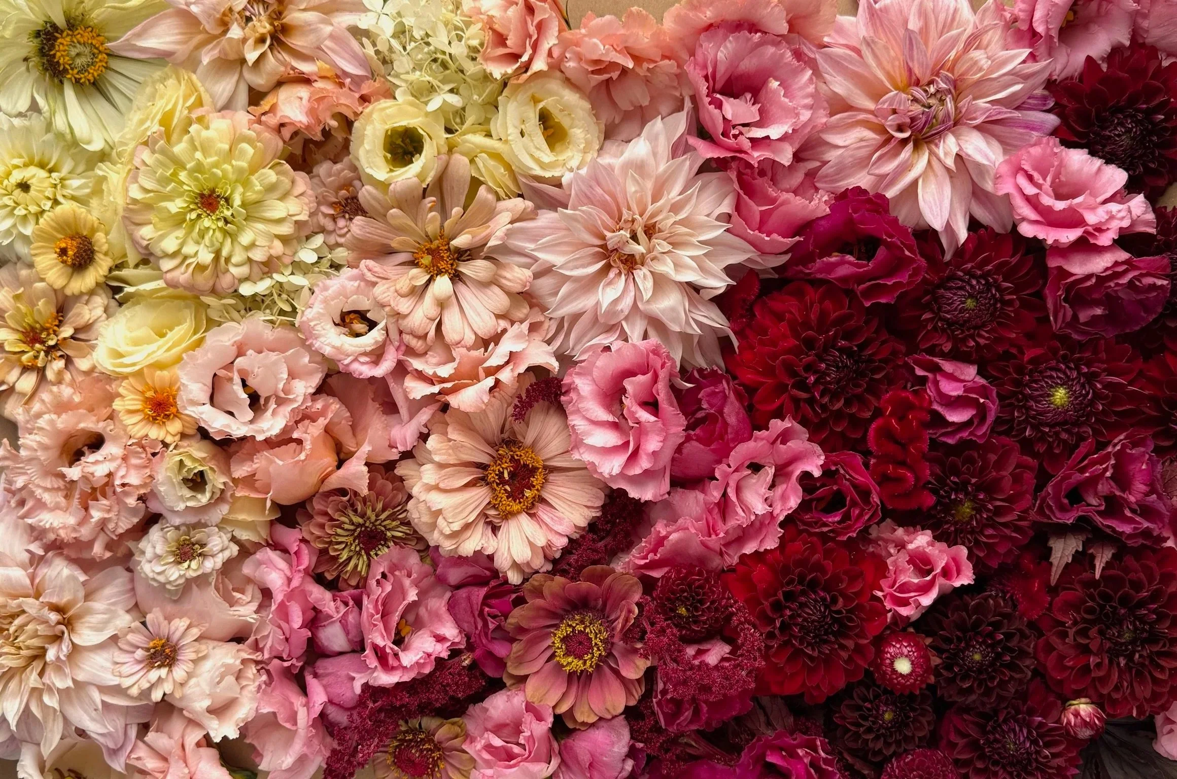
While the Wine Flight color palette is made up of three main colors: cream, muted pink, and burgundy, none of these are really a single color. Just as a glass of wine changes color as the light hits it, the hidden range inside what looks like "one color" is the whole reason this palette works.
Chromatic Coordinates: Mapping the Palette to the Color Wheel
Most of my palettes live in a neighborhood on the color wheel. Wine Flight lives on a single street. When I mapped these hues out, every one of them landed in a nearly straight line radiating out from cream — no detours into another hue family at all. That makes Wine Flight genuinely monochromatic, which is rarer among my palettes than you'd think. Even palettes that are focused on a single color, like Pumpkin Spice, actually span a wider hue range — bronze to ochre to bright orange — rather than sitting in a single line the way Wine Flight does.
The three anchor points are cream, blush, and burgundy — the "three wines" — and a full Wine Flight bouquet typically uses all three to get the complete range of contrast. But there's real flexibility inside that line: you can build a beautiful, cohesive bouquet from just two adjacent tones — cream and blush, or blush and burgundy — you just trade away some of that full, three-wine depth in exchange.
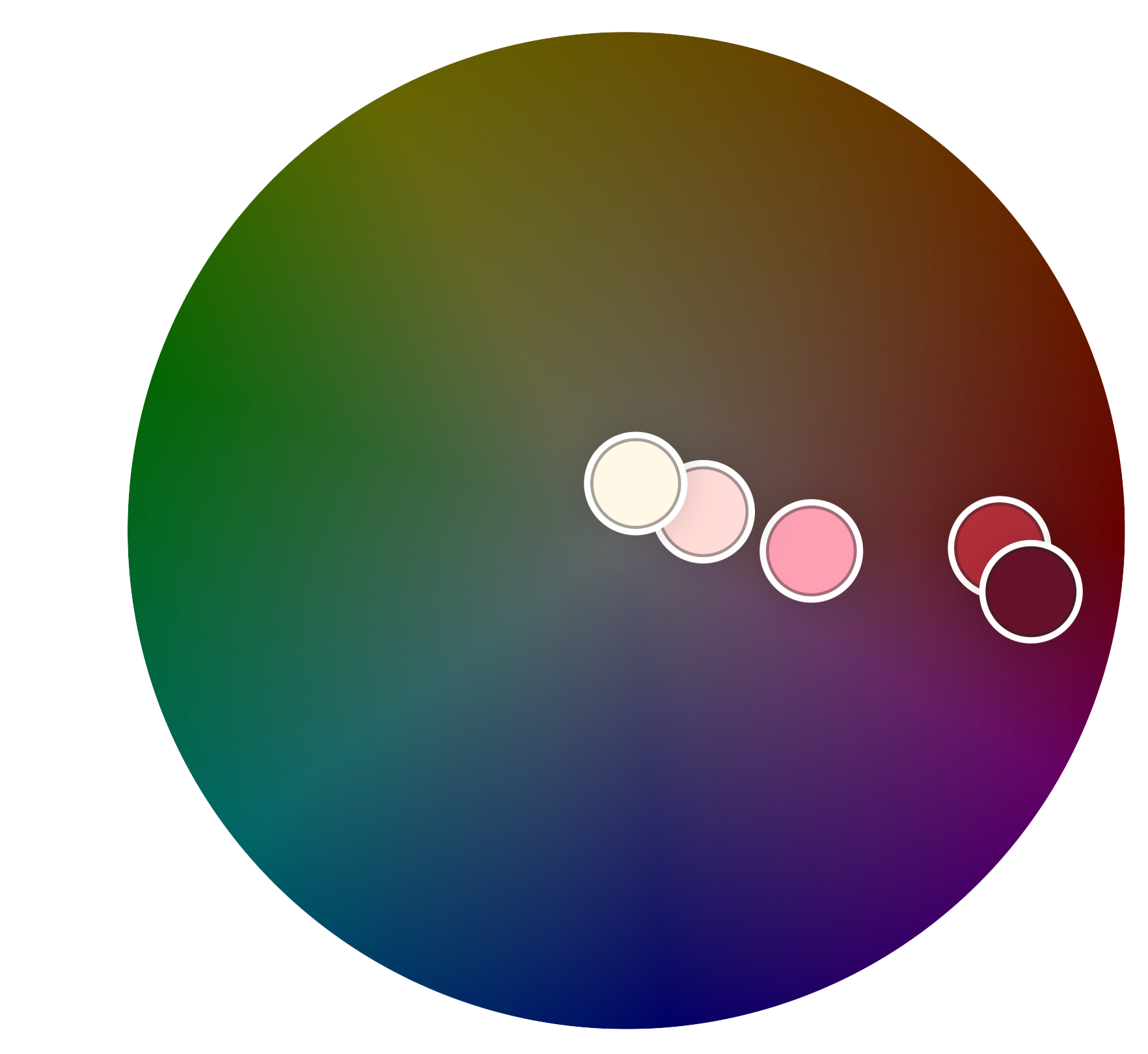
A true monochromatic color palette will show all of the colors plotted in a straight line when mapped onto the color wheel. Wine Flight comes very close.
Palette Perfection: What Makes it Work – and What Wrecks It
The blush-to-burgundy in-between pinks aren't just a nice-to-have here — they're bridge colors, and they're doing real work. They're what keeps this palette from reading as two separate ideas (a light bouquet and a dark one) and instead create one continuous, sophisticated gradient.
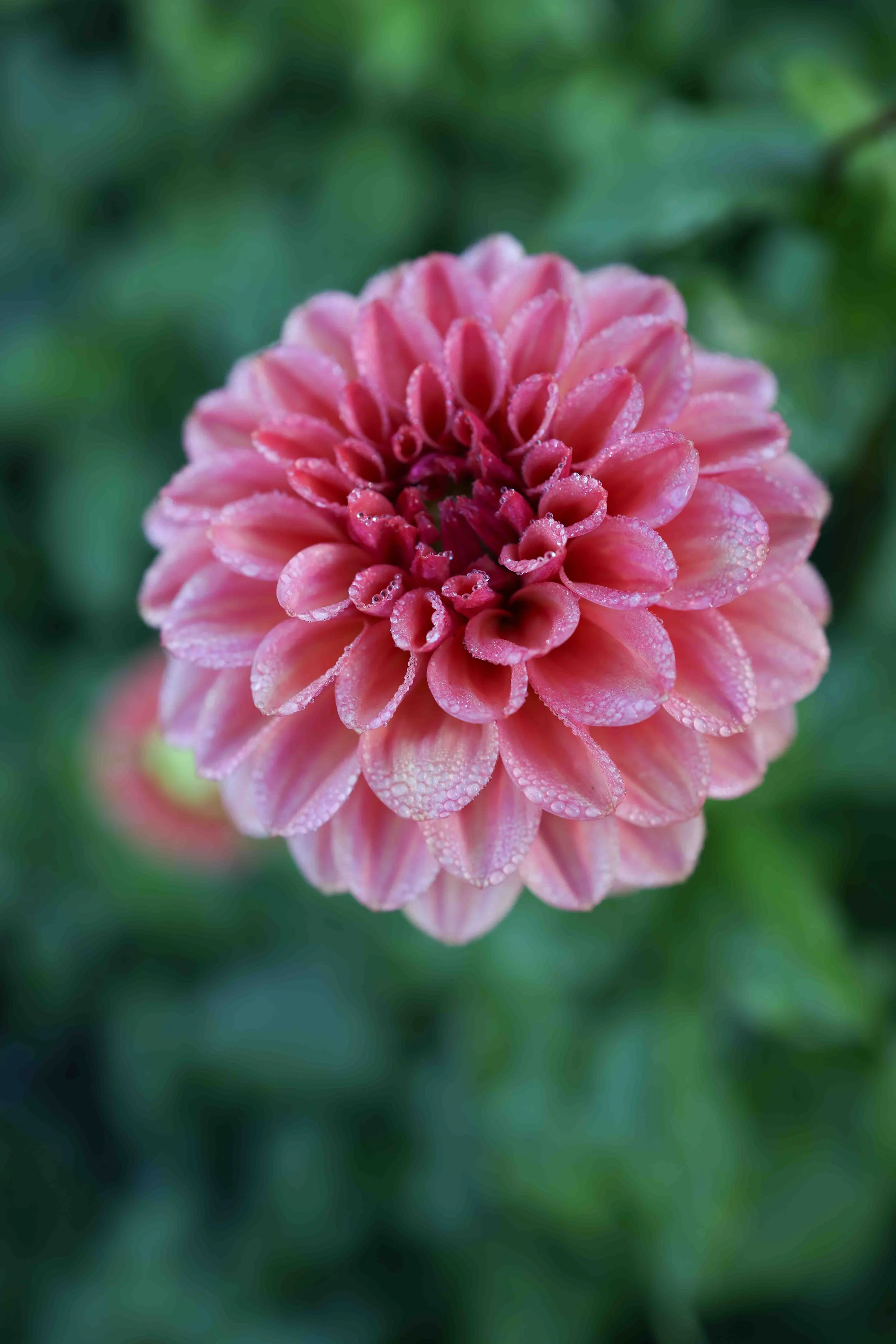
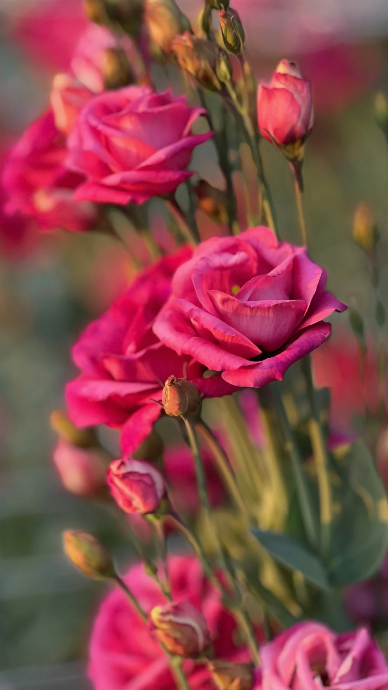
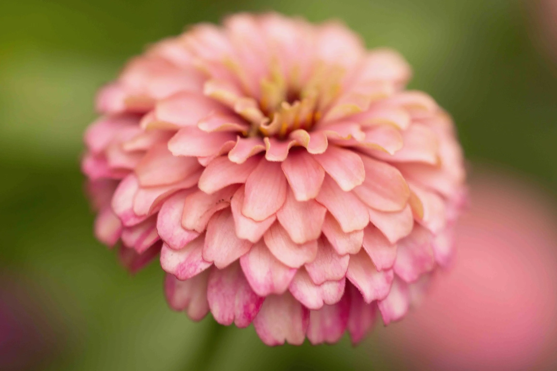
The pinks in a Wine Flight bouquet aren’t just there to represent the rosé wines — they play an important role in bridging the difference between pale creams and dark red/burgundy. That said, a wide variety of hues and shades of pink will work. Warm and muted pinks, as well as blush tones (from left to right: dahlia ‘Rock Run Ashley,’ lisianthus ‘Nightingale,’ and zinnia ‘Ballerina’) are the goal; pinks that are too bright or that lean towards bubble gum will look out of place.
A bright, pure red is allowed in a Wine Flight bouquet, but only as a highlight — never the main story. Surround it with burgundies, and it reads as a spark of energy. Let it dominate on its own, though, and the whole palette shifts register.
What truly breaks this palette is any hue outside the cream/blush/burgundy family showing up in a meaningful amount — a yellow, an orange, a purple. (A stray yellow stamen or an orange throat buried inside a bloom is fine — that's not the same as introducing the color itself.) The other thing that breaks it is swapping cream for true white. Paired with pink and red, white tips the whole palette out of "elegant wine bar" and into "Valentine's Day." Cream is what keeps this palette sophisticated instead of sweet.
Mood in Bloom: The Psychology Behind the Color Palette
There's a well-known wine-tasting study out of the University of Bordeaux where researchers took a white wine, dyed it red with a flavorless additive, and asked trained wine experts to describe it. Almost every one of them described it using red-wine language — dark fruit, tannins, boldness — even though what was in the glass was, chemically, still a white wine. Color didn't just influence their impression. It rewrote what they thought they were tasting.
The same thing is true here. This palette doesn't read as "flowers in wine colors." It reads as sophistication itself — the mood of a candlelit dinner at a really nice restaurant — because our brains are already primed to associate this exact range of tones with something refined, adult, and a little bit indulgent. It is, deliberately, the opposite of childlike or playful. You don't give wine to children, and you don't build this palette for a five-year-old's birthday party.
Speaking of birthdays — Wine Flight is one of the highest-contrast palettes I make, spanning off-white almost to black. Birthday Cake hits nearly that same contrast level, stark white against saturated pink and orange, but the two could not feel more different. Birthday Cake is unapologetic childhood joy, built from the memory of frosting flowers on a buttercream-frosted cake; Wine Flight takes that same light-against-dark punch and turns it into something quieter and more grown-up. The contrast in Wine Flight is less out-loud sugar rush, more the long, satisfied exhale after a really good meal.
Wine Flight is a popular choice for fall weddings, but it isn't limited to events. It also sells well at the farmers market, to customers who are drawn to muted, sophisticated color over anything bright or saturated. So far, I've only ever built and sold it in fall — red wine itself has always felt like a fall/winter association to me — though I'm planning to test early spring and late spring versions next year, using creamy-colored ranunculus, Bordeaux-toned anemones, and tulips or peonies that span the entire color range. Pastels tend to dominate spring buying, so it's genuinely an open question whether customers will want Wine Flight outside of autumn. We'll see.
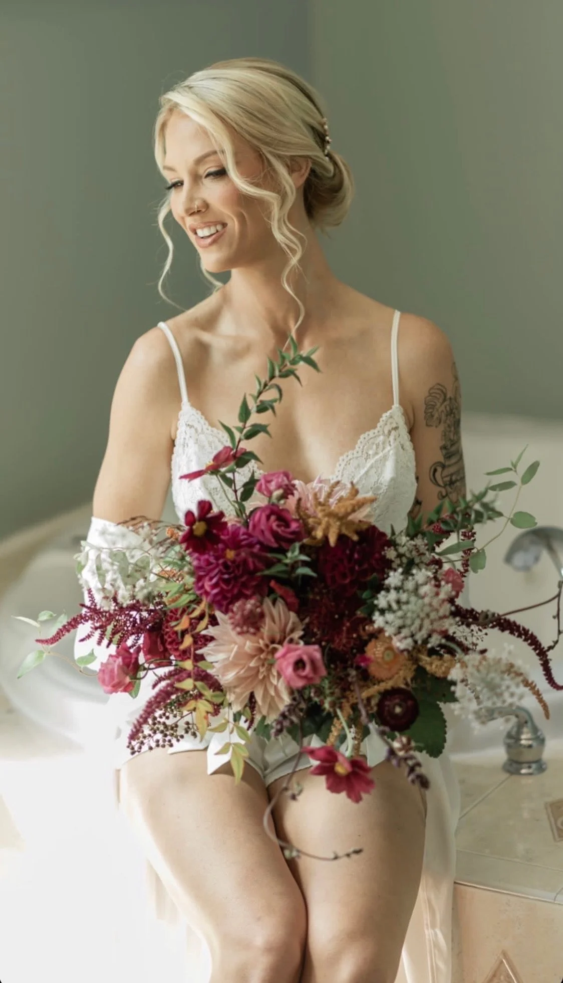
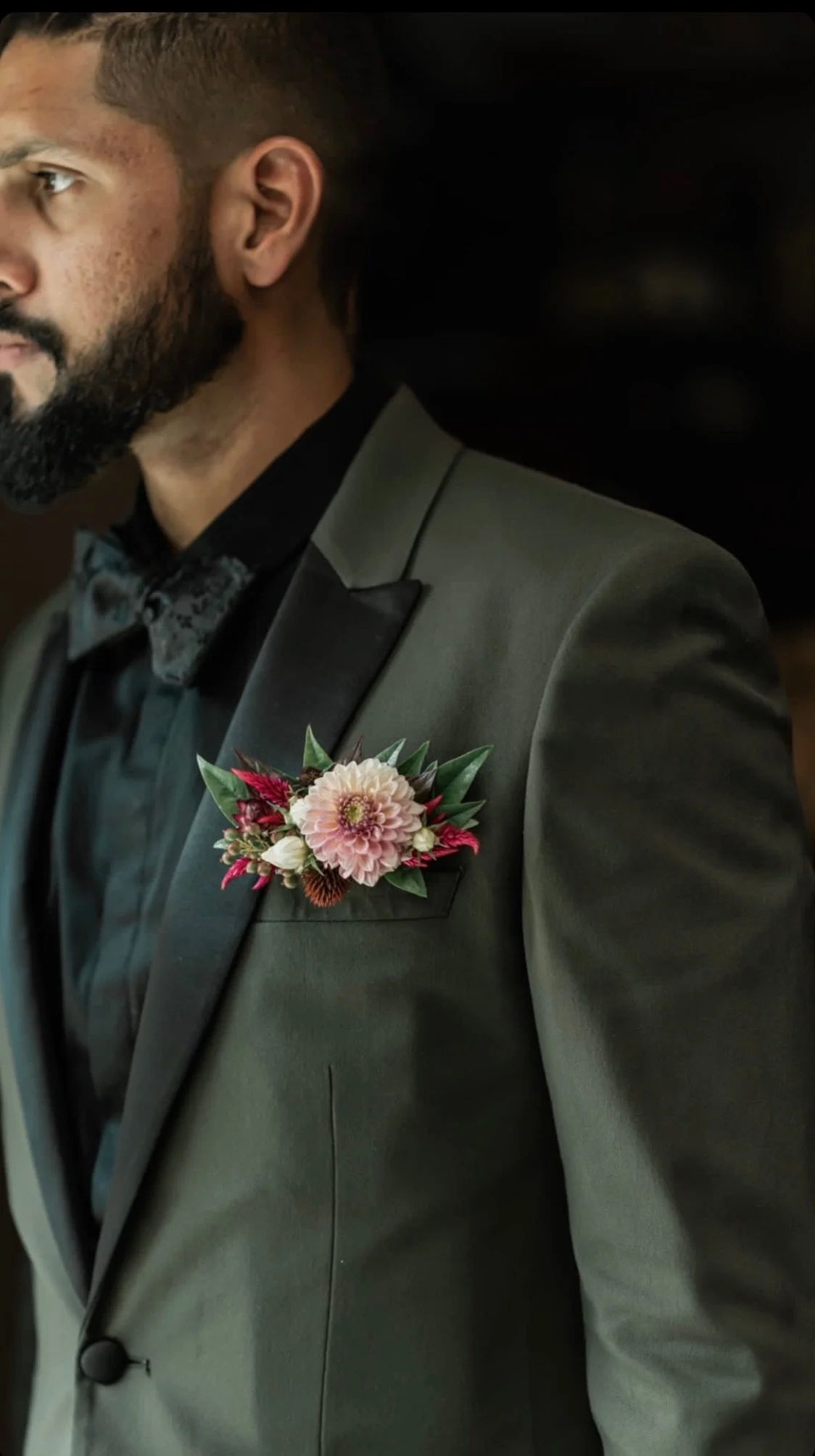
Wine Flight’s sophisticated, fall-forward colors are a wedding classic.
Camera-Ready Colors: Floral Photography Tips for the "Wine Flight" Color Palette
Wine Flight is one of the hardest palettes to photograph, and it comes down to contrast. This palette spans from creamy off-white almost to black, and getting a camera to hold detail at both ends of that range in the same shot is genuinely difficult. Push your exposure to see details in the deep burgundy, and the creams blow out into featureless white. Expose for the creams, and the burgundy collapses into a flat, detail-less black hole in the photo. As with any high contrast subject, it’s generally much better to use an exposure that allows you to keep the detail in the creamy end of the spectrum. It means the dark reds and burgundies will need to be lightened up in the editing process, but that’s better than the alternative. If you use a high enough exposure to see the details in the dark parts of the bouquet, chances are good that you will have lost all detail in the light parts. And while you can lighten up the dark parts of a photo, you can’t bring back color into something that the camera has perceived as white — any details in those areas will be gone.
There's no way around this except good light, careful post-processing, or both. An iPhone camera actually does a surprisingly good job of balancing highlights and shadows on its own, which makes it a better tool for this palette than you might expect. Beyond that, the single most useful edit — and one that almost any editing app, including the built-in tools on a smartphone, can do — is adjusting shadows and highlights after the fact: raise the shadows slightly so the burgundies keep some visible texture and detail, and/or pull the highlights down a touch so the creams don't overexpose.
The bottom line: plan for this palette to be difficult, especially in flat or poor light, and go in expecting to spend a little time in post. It's worth it — there are few other palettes in the lineup that read quite as elegant once you get the exposure right.
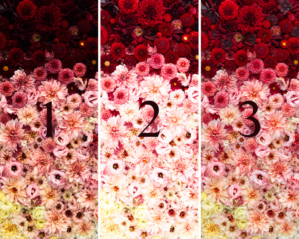
1 (left): at settings that allow for the right exposure of the creams in the lower part of the photo, the burgundies at the top are nearly black, and all detail there is lost.
2 (middle): if the exposure is bright enough to show detail in the burgundies, then the creams and even the pinks are washed out.
3 (right): the perfect balance. Photo editing is often required to allow all of the colors within Wine Flight to be seen the way your eye perceives them.